20 Sitting Room Ideas Color Schemes
The color palette of a sitting room plays a huge role in shaping how the space feels—whether it’s peaceful, energetic, warm, or sophisticated. It’s more than just paint on walls; it’s the atmosphere, the emotion, and the experience you create for yourself and your guests. Below are 20 well-thought-out sitting room color schemes that can breathe life into your space while keeping it functional, cozy, and stylish.
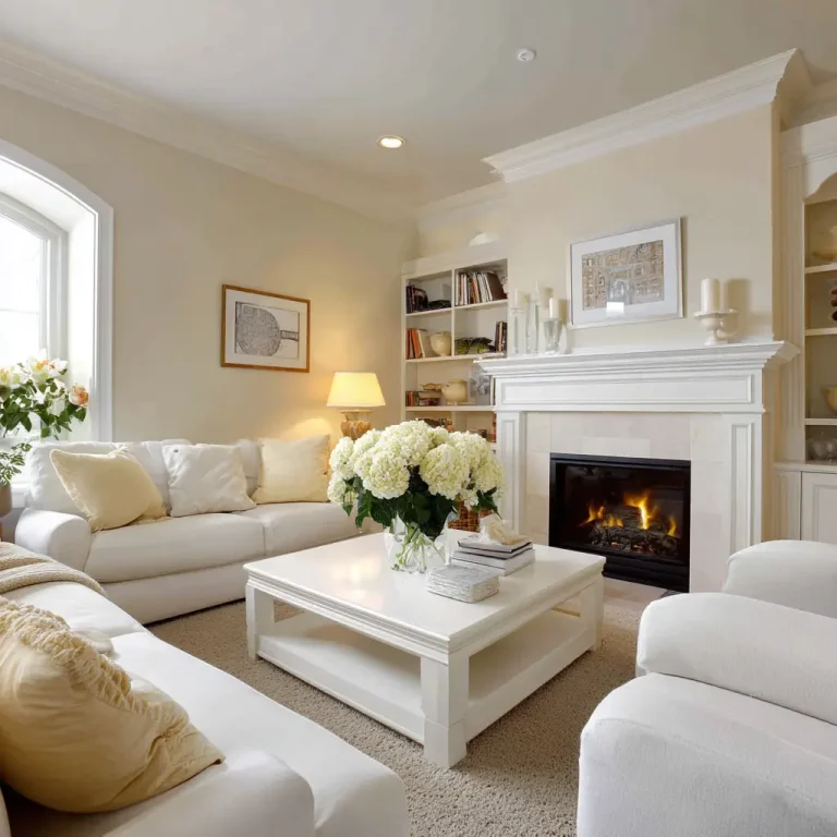
1. Warm Beige and Soft White
This classic combination creates an effortlessly calming space. Warm beige on the walls adds a cozy undertone, while soft white trims, ceilings, or furnishings brighten the room and make it feel clean and inviting. It’s perfect for those who want a neutral base with a touch of warmth.
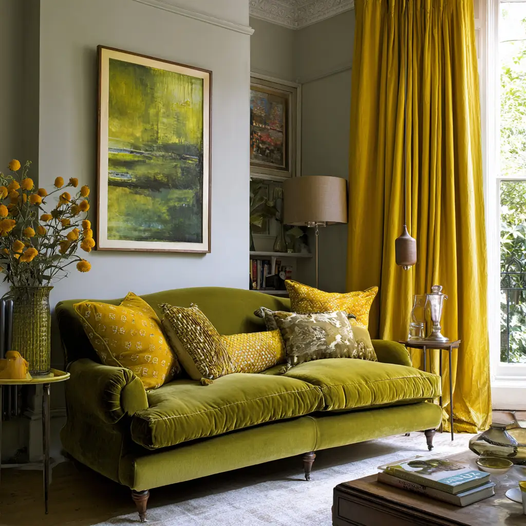
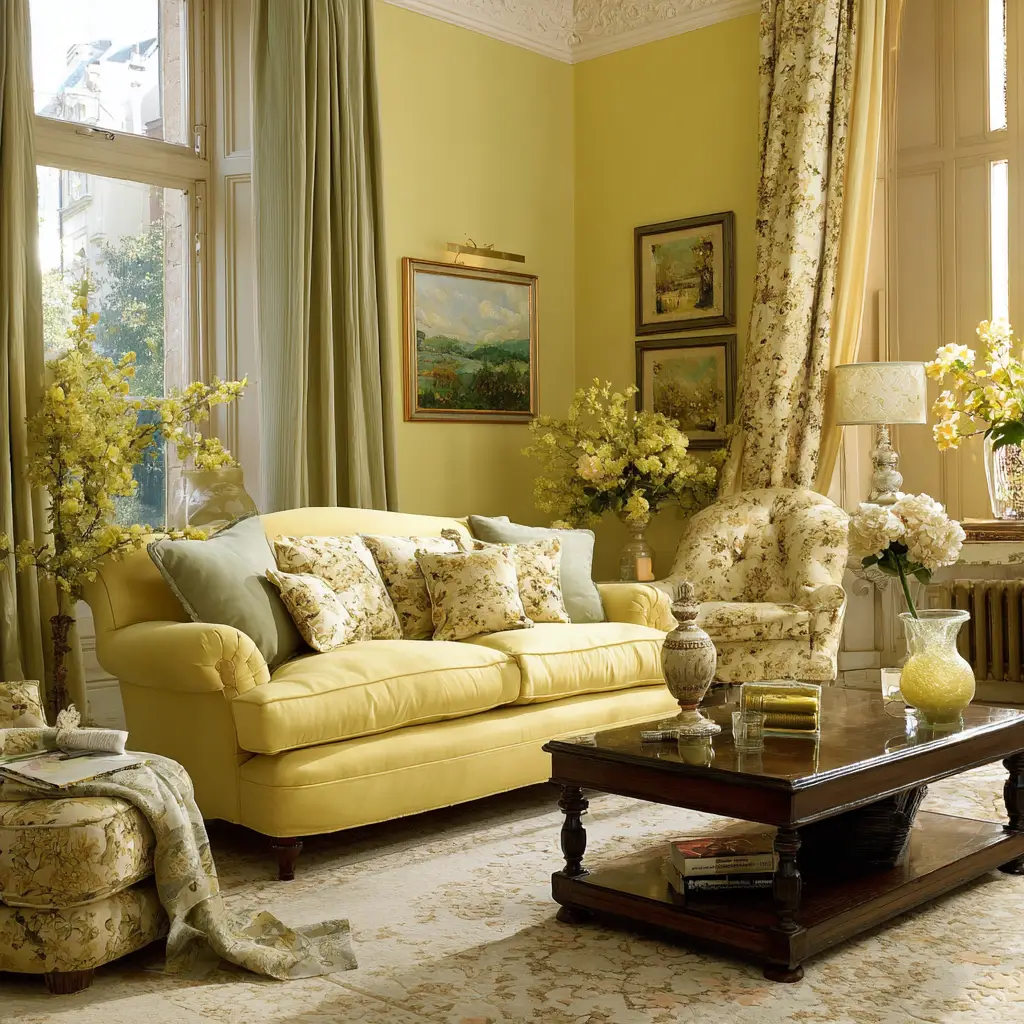
2. Olive Green and Mustard Yellow
Inspired by nature, this pairing brings a rich and grounded energy to a sitting room. Olive green feels earthy and comforting, while mustard yellow acts as a vibrant accent, whether through cushions, throws, or wall art. Together, they create a space that feels cozy, mature, and full of character.
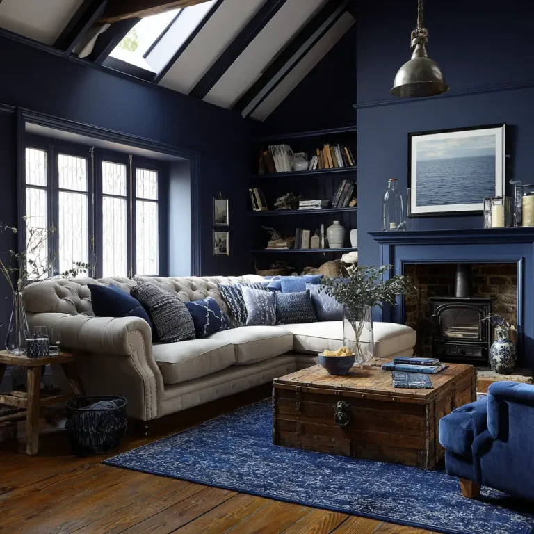
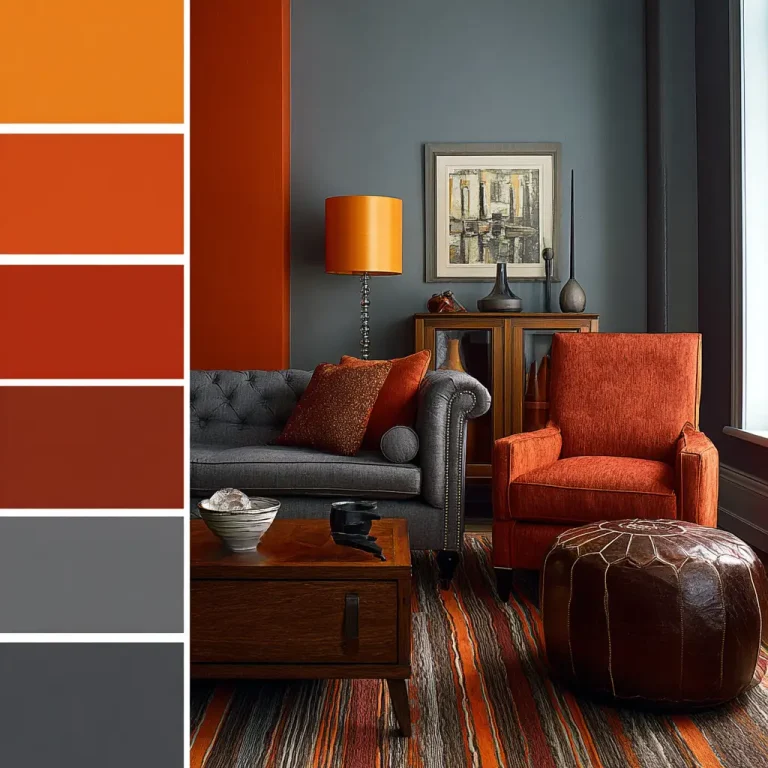
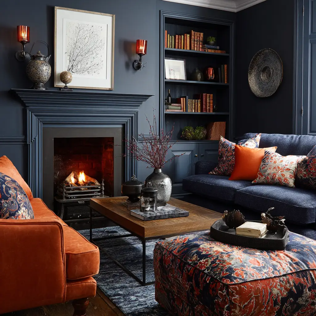
3. Navy Blue and Burnt Orange
Navy is bold, dependable, and timeless. When paired with burnt orange, it creates an energizing contrast that’s perfect for statement decor. A navy accent wall can provide depth, while burnt orange elements in upholstery or accessories give the room personality and warmth.
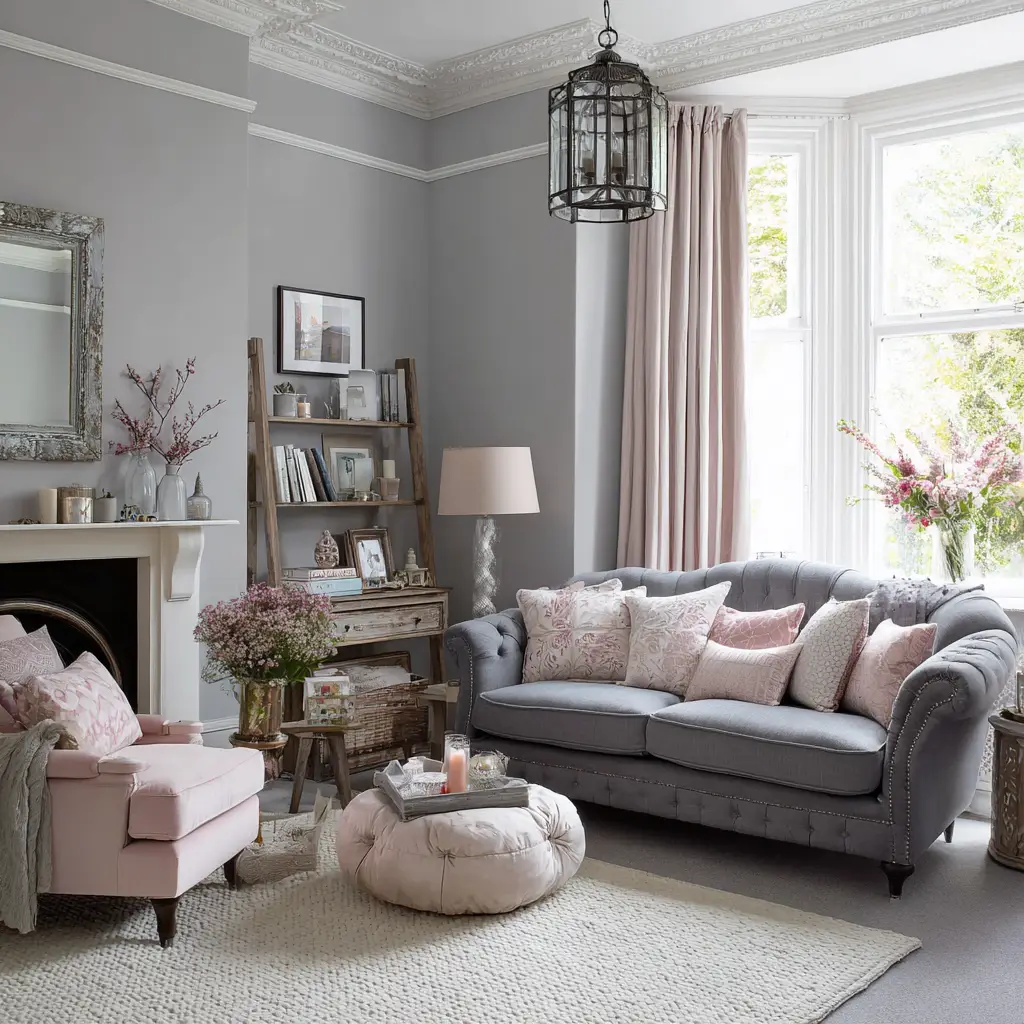
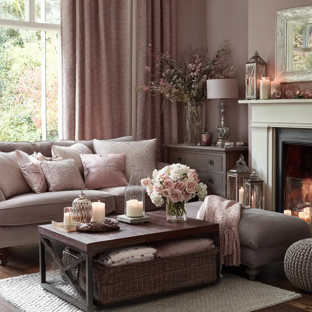
4. Pale Grey and Dusty Pink
This is a soothing, elegant mix ideal for creating a modern yet cozy sitting room. Pale grey serves as a calm foundation, allowing dusty pink to bring in a soft, romantic accent. This color combo feels both grown-up and welcoming, suitable for everything from minimalism to soft vintage themes.
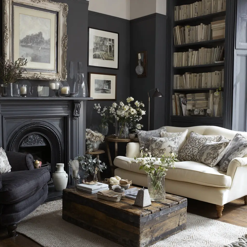
5. Charcoal and Cream
For a more dramatic and stylish room, charcoal brings richness and depth. To balance its intensity, pair it with cream-colored furniture or accessories. This color scheme is particularly great in rooms with large windows or good lighting, where the contrast can shine without overwhelming the space.
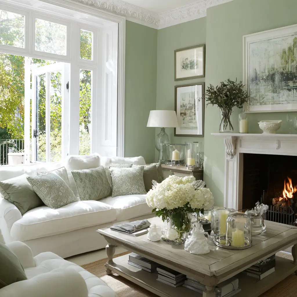
6. Sage Green and White
Sage green is calming and fresh—a perfect option if you’re looking to connect the indoors with nature. When paired with crisp white on ceilings, curtains, or trim, it creates an airy and balanced look. This palette works beautifully with wooden or rattan accents.
7. Blush Pink and Taupe
Blush pink offers a gentle warmth, while taupe provides a grounding effect. This elegant combination can bring softness and depth to a sitting room, creating a space that feels serene and slightly luxurious. It’s ideal for contemporary homes that want a hint of romance.
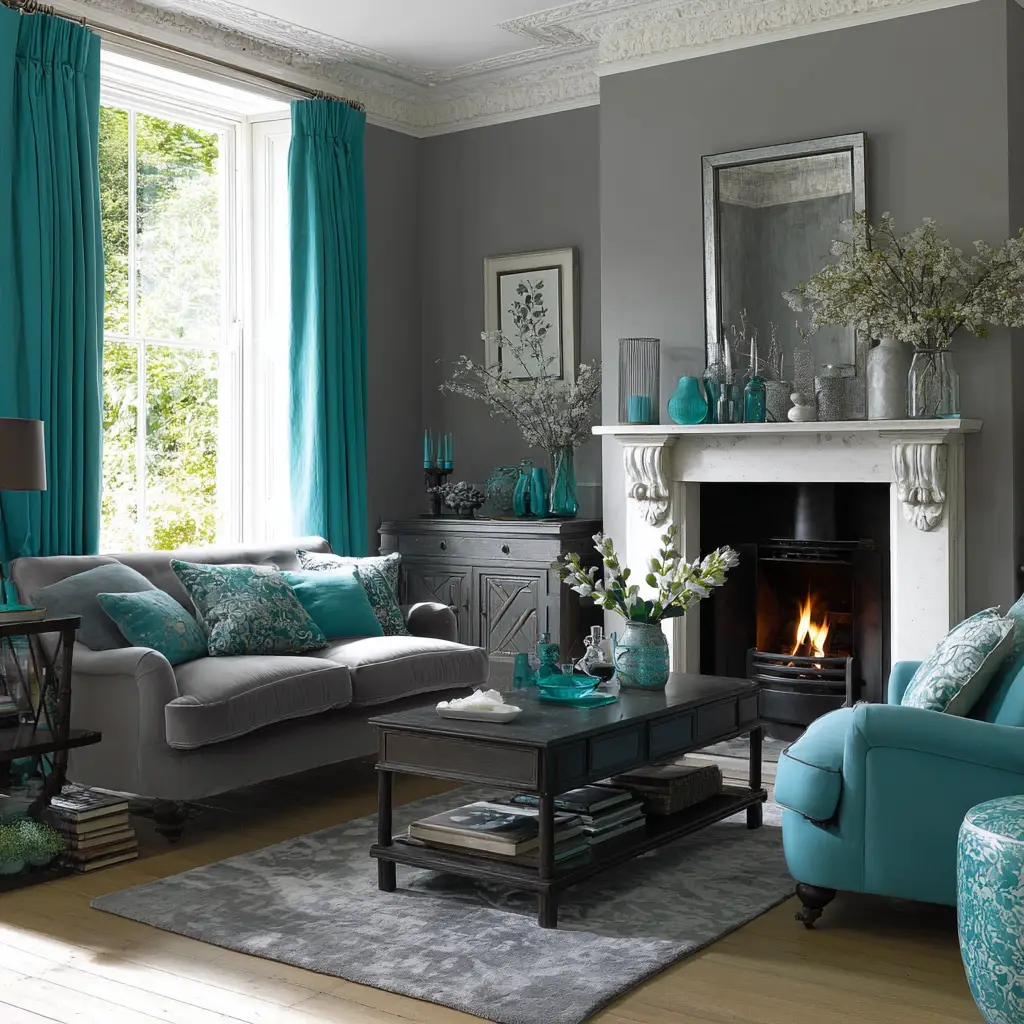
8. Teal and Soft Grey
Teal injects energy and vibrancy into the room without being too overpowering. When balanced with soft grey, the overall look is modern and refined. This combo works great with gold or brass accents, giving the room a touch of glam without sacrificing comfort.
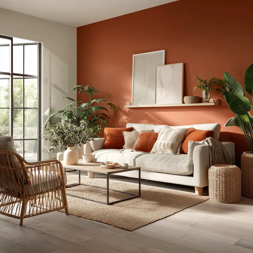
9. Warm Terracotta and Off-White
Terracotta walls or accents instantly bring warmth and a sense of the Mediterranean indoors. When toned down with off-white elements—like curtains, furniture, or rugs—you get a space that feels grounded, earthy, and welcoming. It’s a timeless look that feels personal and handcrafted.
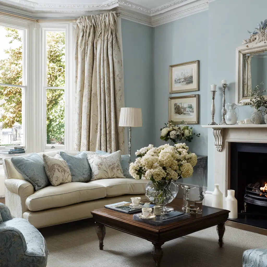
10. Sky Blue and Ivory
If you want a light and breezy sitting room, sky blue is a charming choice. Paired with ivory, it evokes feelings of calm and space. This is an excellent palette for smaller rooms or those filled with natural light. Adding coastal or vintage accents can enhance the feeling.
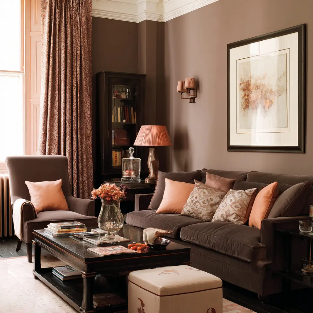
11. Mocha Brown and Pale Peach
Mocha adds richness and depth, bringing a sense of stability to your sitting room. Pale peach introduces warmth and a touch of playfulness. When used together, these colors create a cozy, inviting environment with a slightly retro charm that still feels modern.
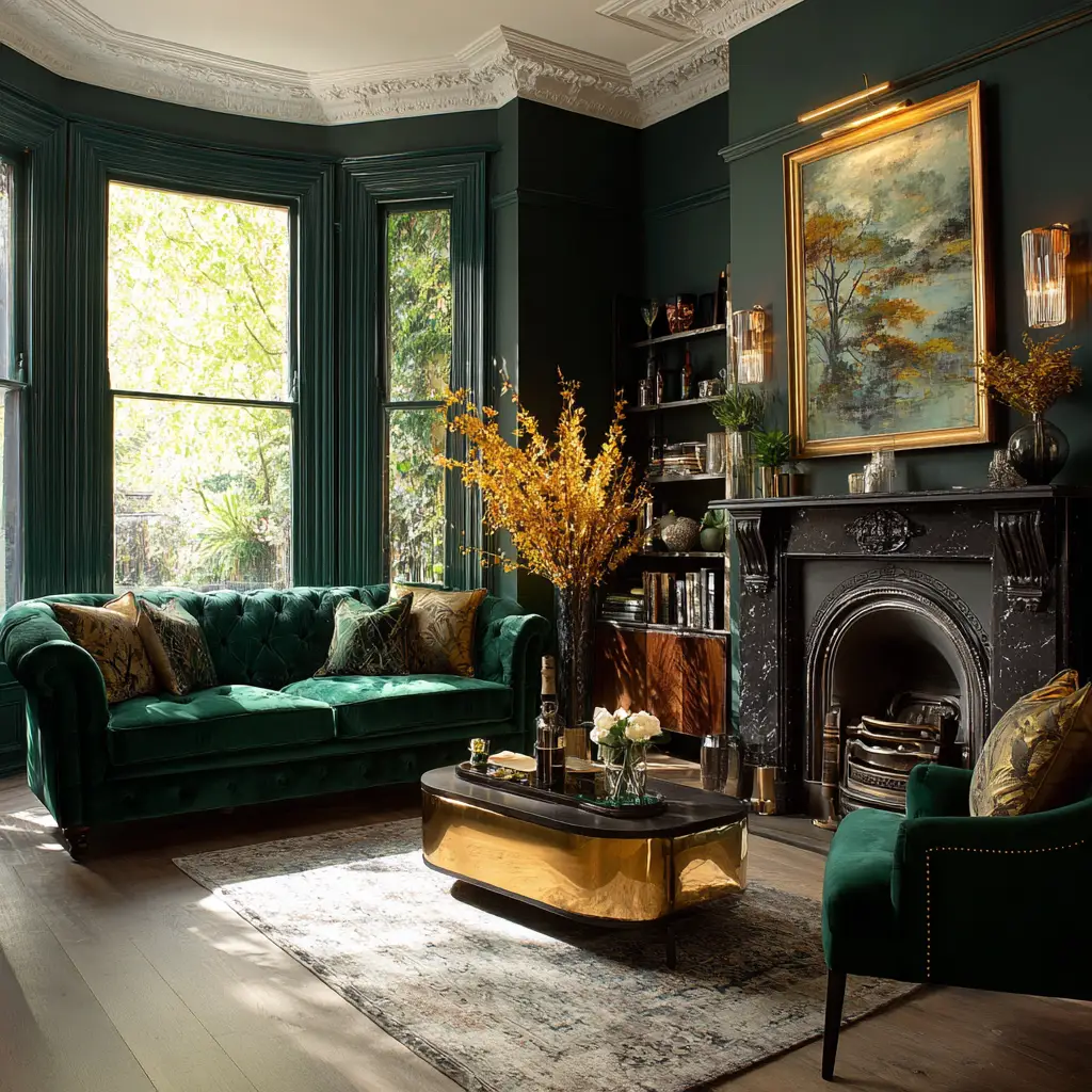
12. Forest Green and Gold
Forest green is bold and lush, reminiscent of nature and luxury. Add gold elements—such as side tables, lamp bases, or cushions—and you instantly elevate the look. This pairing is perfect for elegant, classic interiors or rooms with a traditional structure.
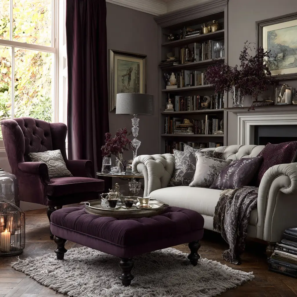
13. Deep Plum and Light Grey
Plum offers a luxurious and rich hue that adds drama to a sitting room. When offset by light grey, the overall effect is refined and balanced. This scheme works well in more formal settings or rooms where you want a touch of sophistication without going too dark.
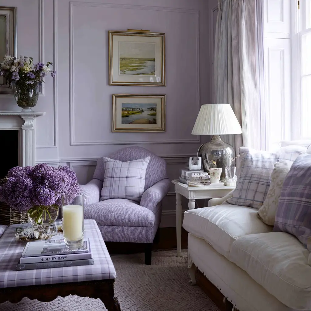
14. Soft Lavender and White
Soft lavender brings a whisper of color that can be both refreshing and calming. When paired with white walls or furnishings, it opens up the space while maintaining a light and airy feel. This palette is ideal for those who want a serene escape within their home.
15. Rust Red and Beige
Rust red, with its earthy undertones, gives off a grounded and nostalgic feel. Beige acts as the perfect neutral to tone it down. The combination feels rustic, warm, and lived-in—ideal for sitting rooms that are frequently used for gatherings and relaxation.

16. Butter Yellow and Sage
Butter yellow is soft, sunny, and cheerful. Sage, on the other hand, brings balance with its cooler, subdued energy. Together, they create a space that feels both cozy and light-hearted, making it great for family rooms or spaces where you want a bit of uplift.
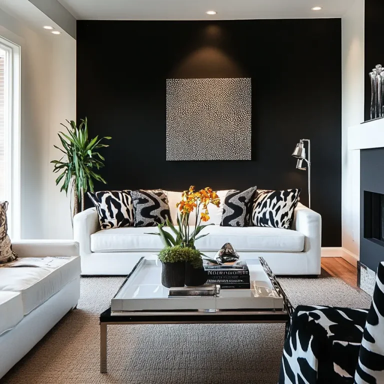
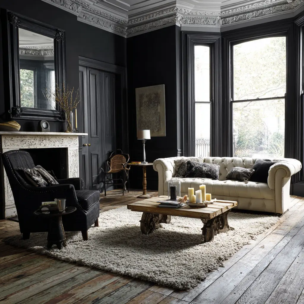
17. Black and Pale Wood
Black brings a sleek, modern edge, especially when used in furniture or accent walls. Pale wood, like birch or oak, softens the look and adds warmth. This minimalist Scandinavian-inspired combination is clean, stylish, and highly adaptable.
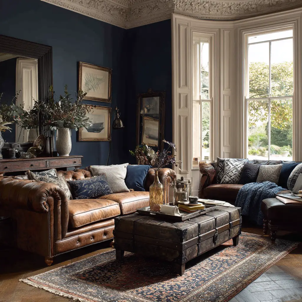
18. Indigo and Sand
Indigo, with its deep, oceanic tone, brings drama and richness to the room. Paired with soft sand-colored neutrals, it feels balanced and grounded. This palette is great for creating a relaxed, beach-inspired sitting room that still feels polished.
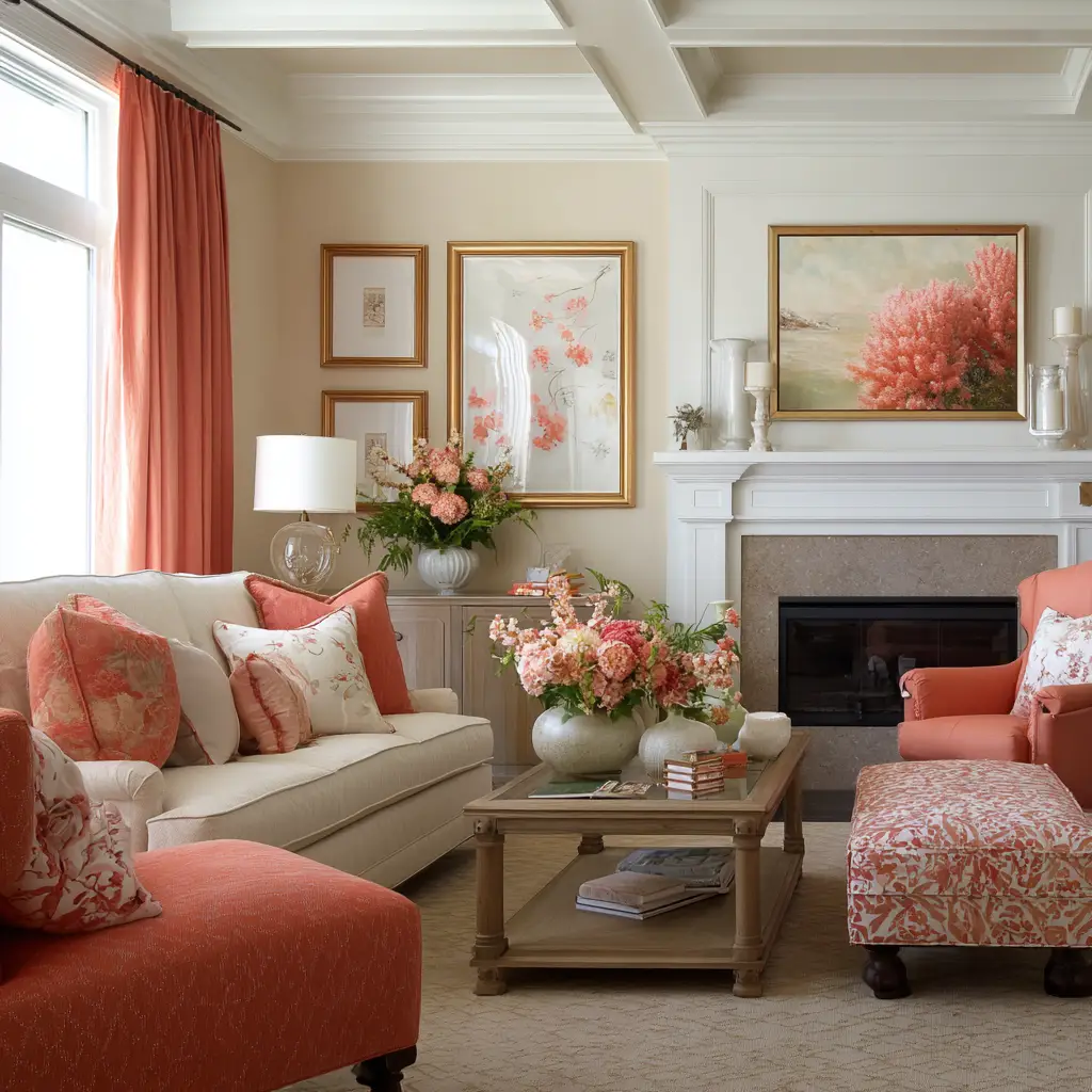
19. Coral and Cream
Coral is lively and warm—great for spaces that want a splash of personality. Cream tones it down just enough, allowing the coral to shine without overwhelming the room. This combination works especially well in sun-drenched rooms or with boho-style interiors.
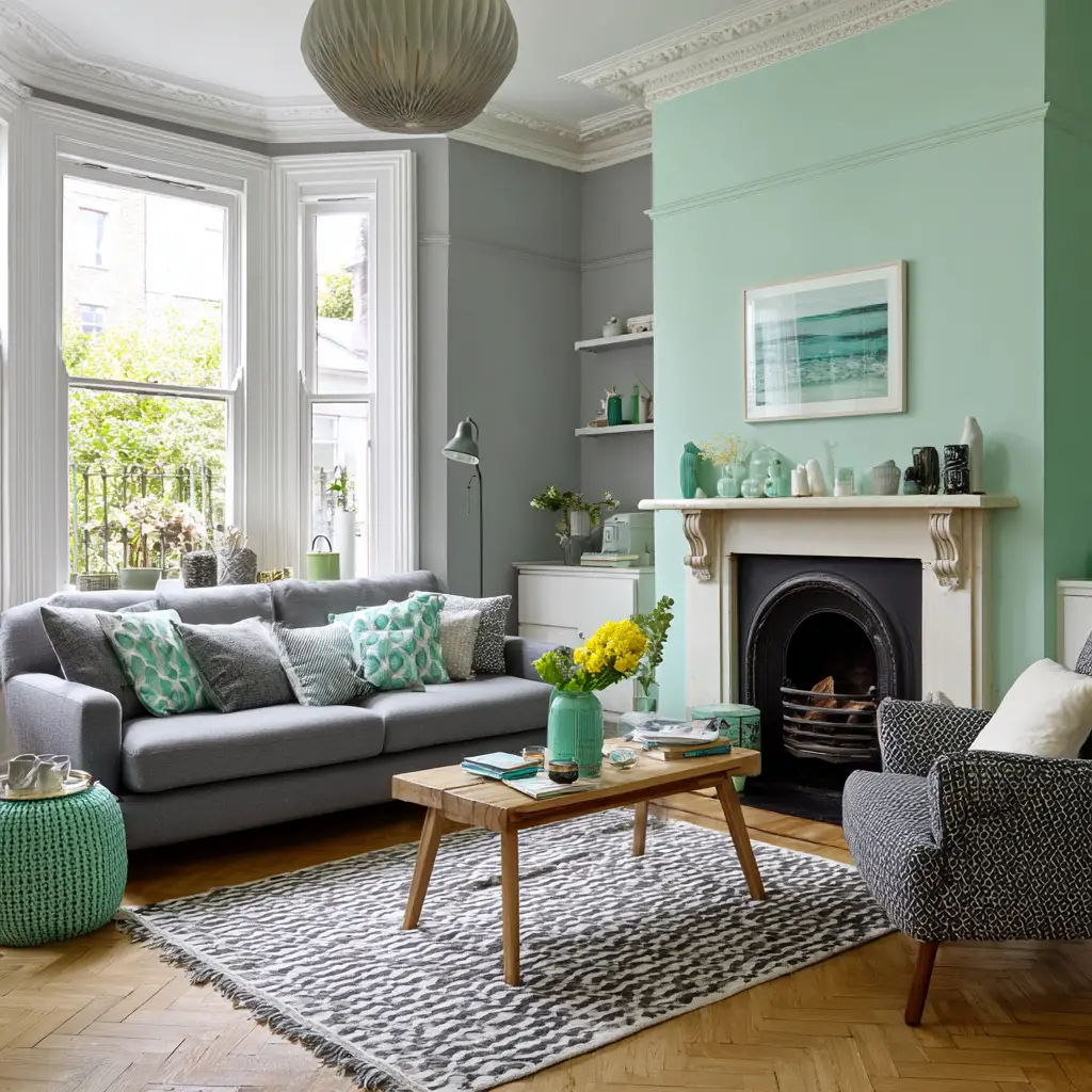
20. Cool Mint and Grey
Cool mint brings in a fresh, almost spa-like calmness, while grey helps stabilize the look. It’s a great palette for modern, clean spaces that still want a touch of color. Add chrome or white accessories to enhance the crispness.
FAQs
What color scheme is best for a small sitting room?
Soft, light colors like pale grey, white, or pastel shades are best for small sitting rooms. They reflect more light and help the space feel open and airy. Avoid using too many dark tones, unless they are balanced with bright elements.
Are dark colors suitable for sitting rooms?
Yes, dark colors can create a cozy, elegant vibe if used wisely. Use them as accent walls or in furniture and balance with lighter tones, good lighting, and natural materials to avoid the room feeling too enclosed.
How many colors should be in one room’s color scheme?
A good rule is the 60-30-10 principle: 60% dominant color (walls), 30% secondary color (upholstery), and 10% accent (decor and accessories). This keeps things balanced and visually cohesive.
Can warm and cool tones be mixed?
Absolutely. The trick is to mix them intentionally. For example, a cool blue wall can be warmed up with tan leather furniture or brass accents. When balanced well, it adds depth and dimension to the room.
Do color schemes affect how a room feels?
Yes, colors deeply influence mood. Warm tones like yellow and terracotta create a cozy, welcoming environment, while cooler tones like green and blue bring a sense of calm and tranquility.
Conclusion
Choosing a color scheme for your sitting room is more than just a design decision—it’s about creating a space where you feel comfortable and truly at home. Whether you’re drawn to earthy tones, bright contrasts, or soft pastels, your palette sets the mood and personality of the room. Use these 20 ideas to inspire a sitting room that speaks to your lifestyle, reflects your taste, and makes everyone who enters feel instantly at ease.