25 Dining Room Color Scheme Ideas
The dining room is where people gather to share meals, connect with family, and host loved ones. It’s not just a place for eating—it’s a space that reflects your taste, hospitality, and lifestyle. Choosing the right color scheme can greatly enhance the atmosphere, whether you want something warm and cozy, modern and sleek, or vibrant and energetic. These 25 dining room color scheme ideas offer a variety of inspiring combinations that can make your dining space feel just right.
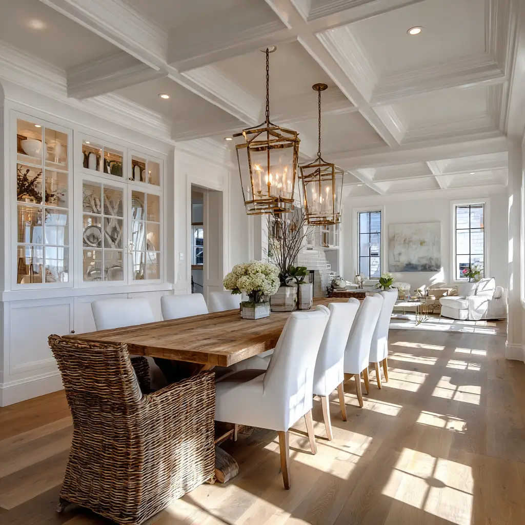
1. Classic White and Wood
A clean white backdrop paired with warm wooden tones creates an inviting, timeless look. This scheme brings balance and brightness, perfect for any style from modern farmhouse to coastal.
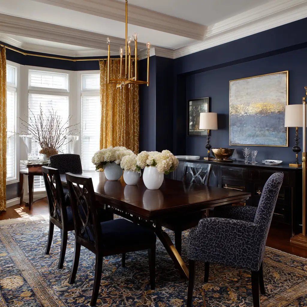
2. Navy and Gold
Deep navy walls with gold accents, such as a chandelier or frame, lend a luxurious and dramatic feel to the dining area. It’s elegant and ideal for formal settings.
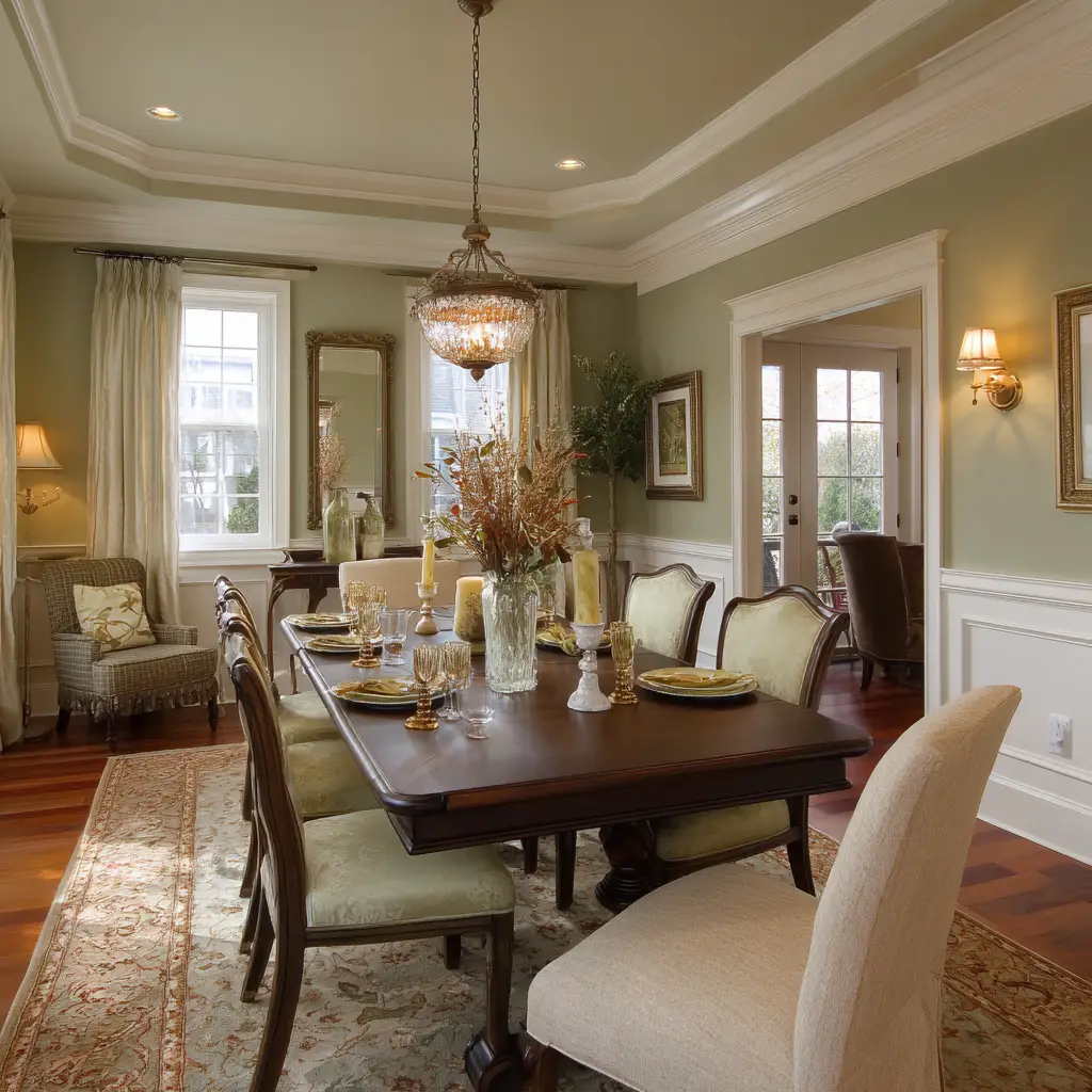
3. Sage Green and Cream
Sage green adds softness and calm, especially when paired with creamy whites. This combination works beautifully in rustic or organic-inspired interiors.
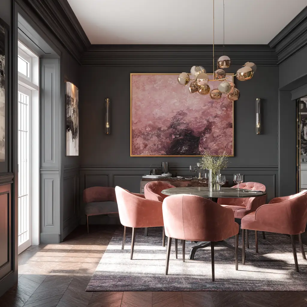
4. Charcoal and Dusty Rose
The coolness of charcoal grey and the warmth of muted rose tones create a sophisticated and slightly romantic setting. Great for modern or transitional dining rooms.
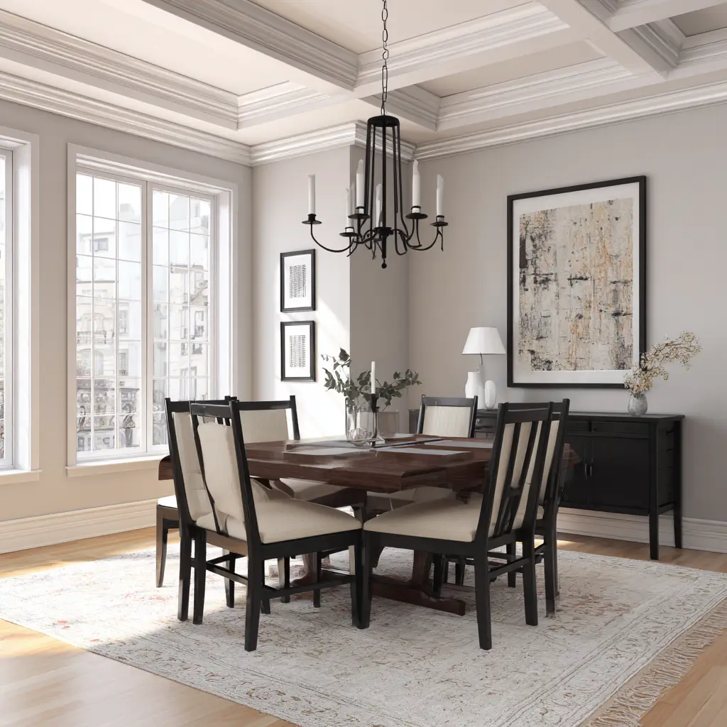
5. Greige and Black
A blend of grey and beige (greige) as the base, combined with black accents through lighting or furniture, offers a contemporary yet cozy aesthetic.
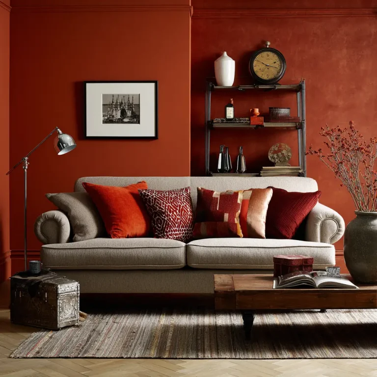
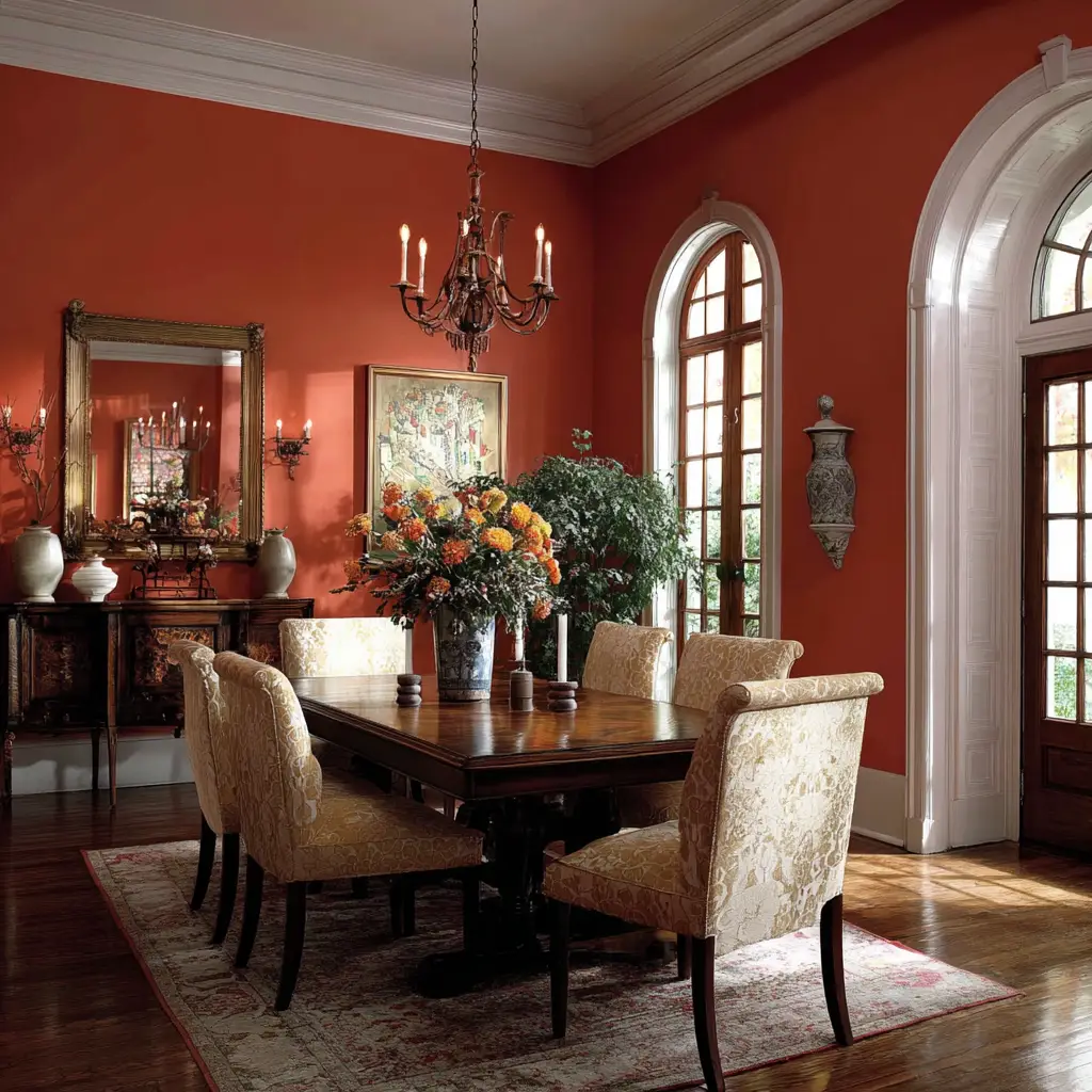
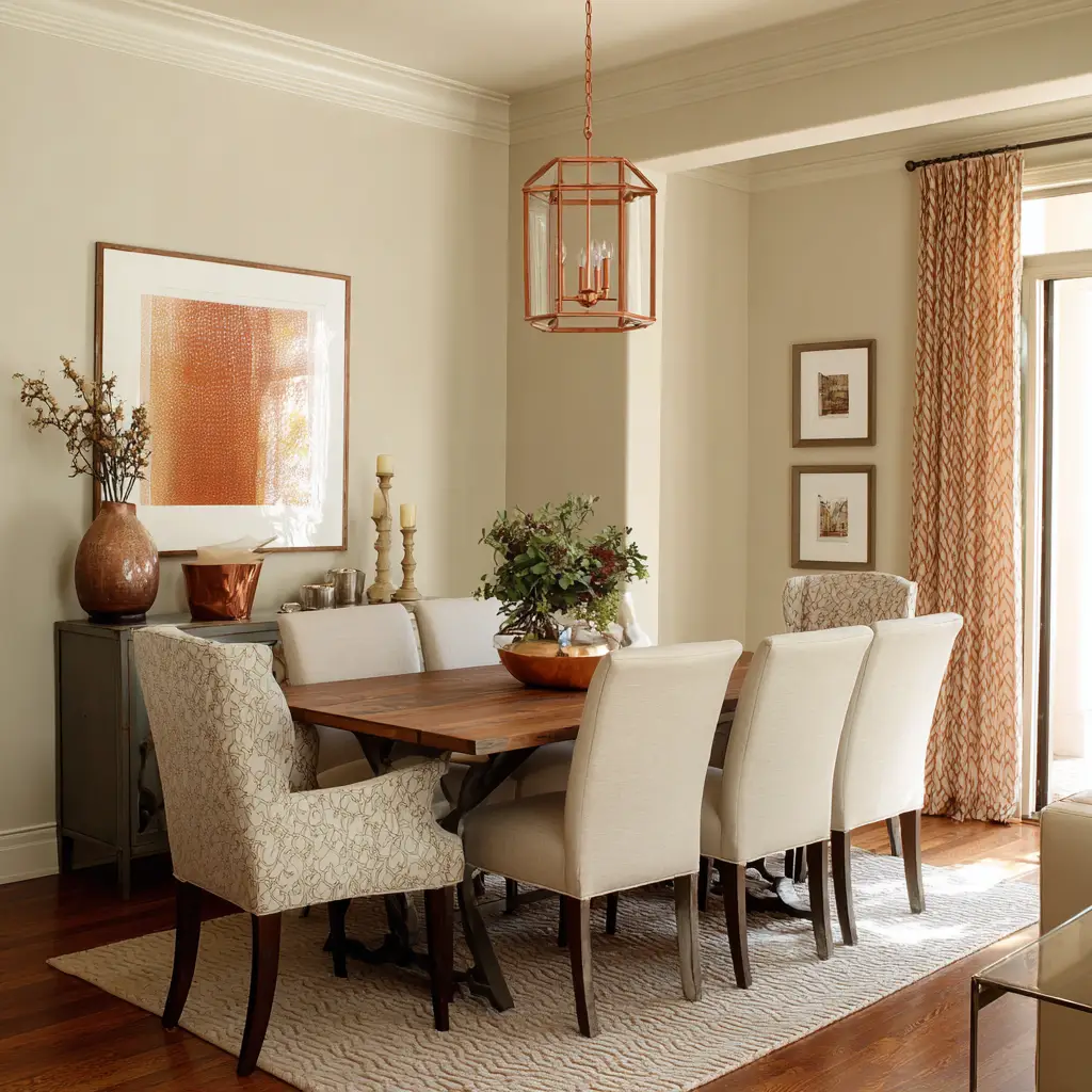
6. Terracotta and Ivory
Terracotta walls or accents bring an earthy, Mediterranean flair. Combine with ivory furniture or curtains to soften the warmth and keep it light.
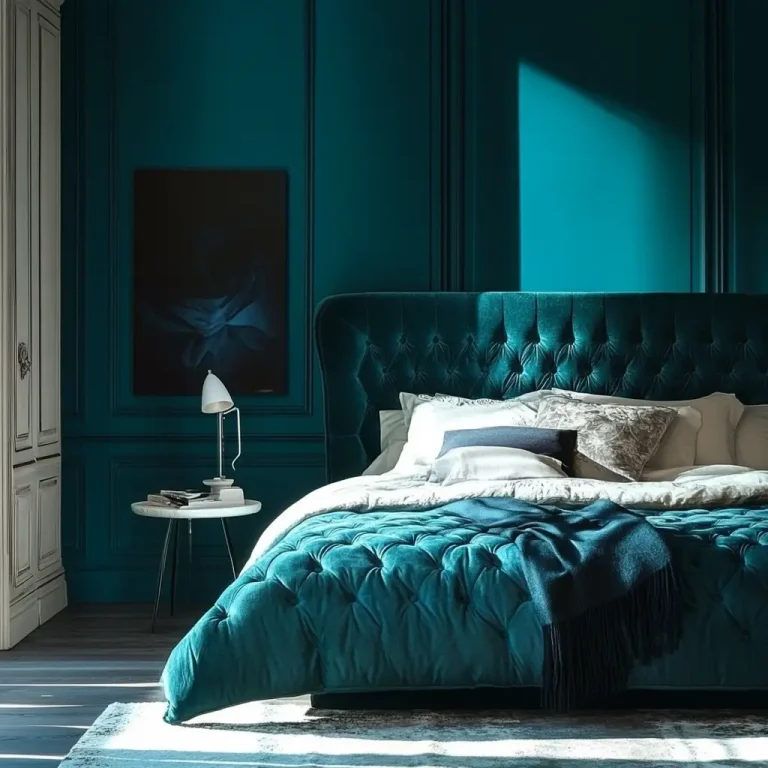
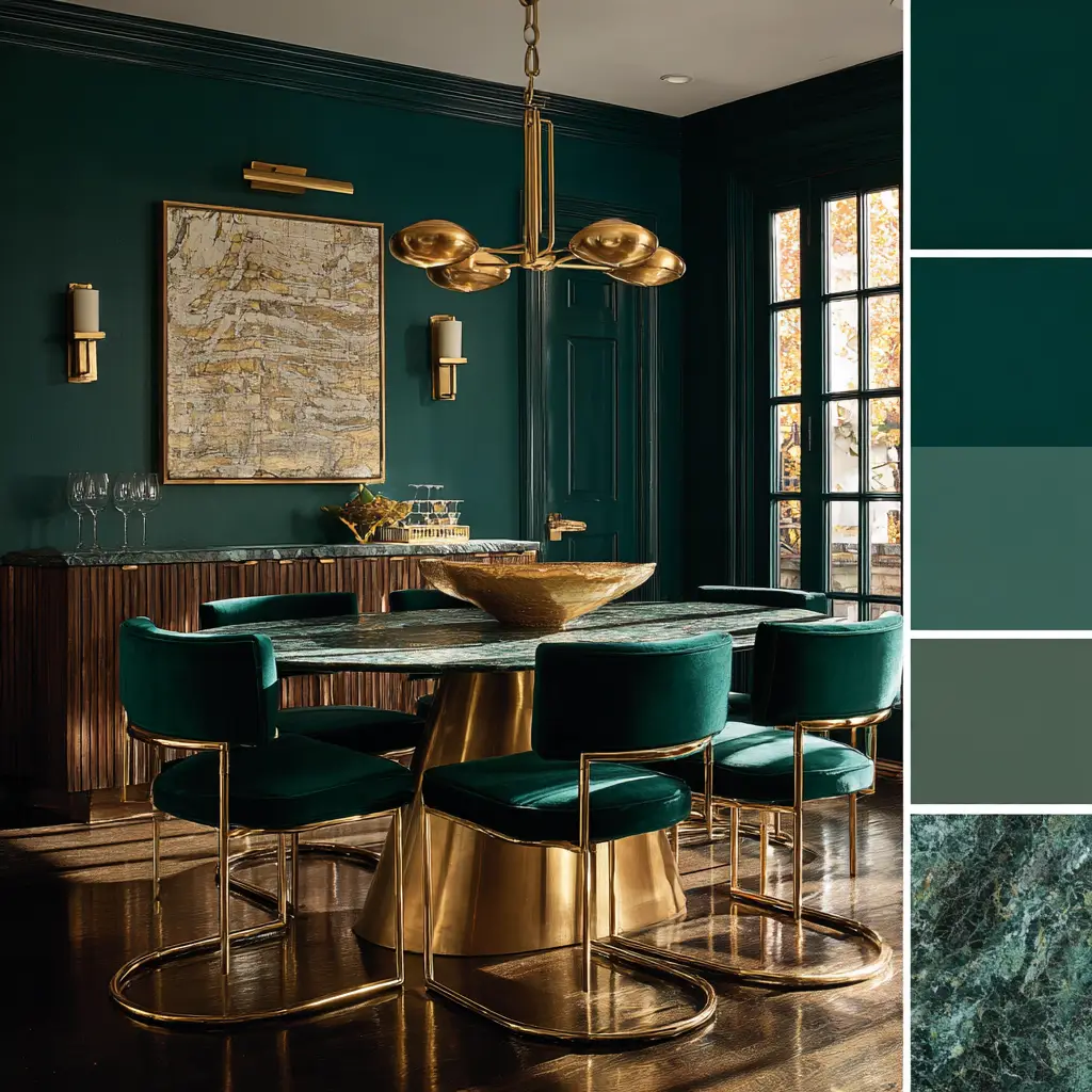
7. Emerald and Brass
Rich emerald green brings depth and a jewel-toned richness, while brass accents elevate the elegance. This combo is bold yet balanced for a striking dining room.
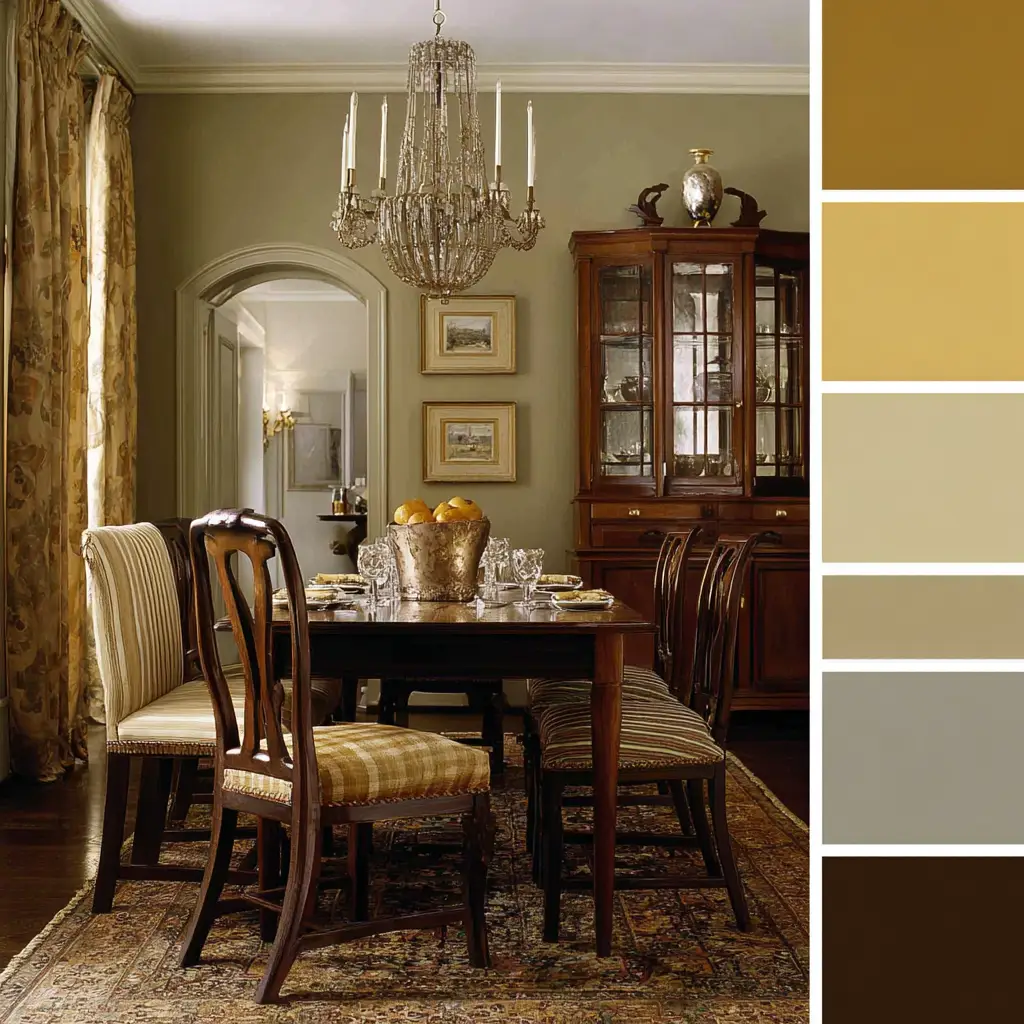
8. Beige and Olive
Warm beige walls with olive green chairs or décor create a grounded, natural feel—ideal for a calm and serene dining space.
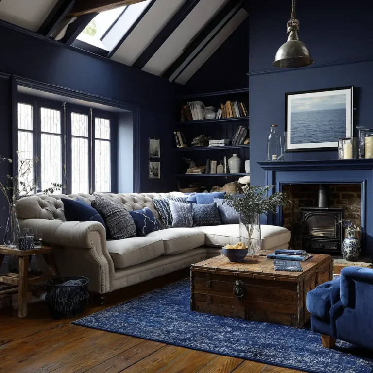
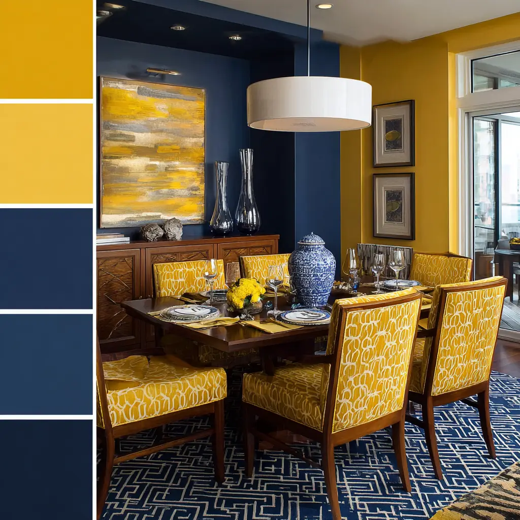
9. Mustard and Navy
This energetic pair works well when mustard yellow is used as a feature wall or chair color, and navy balances it out with depth and contrast.
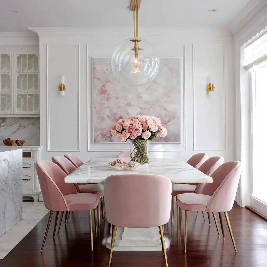
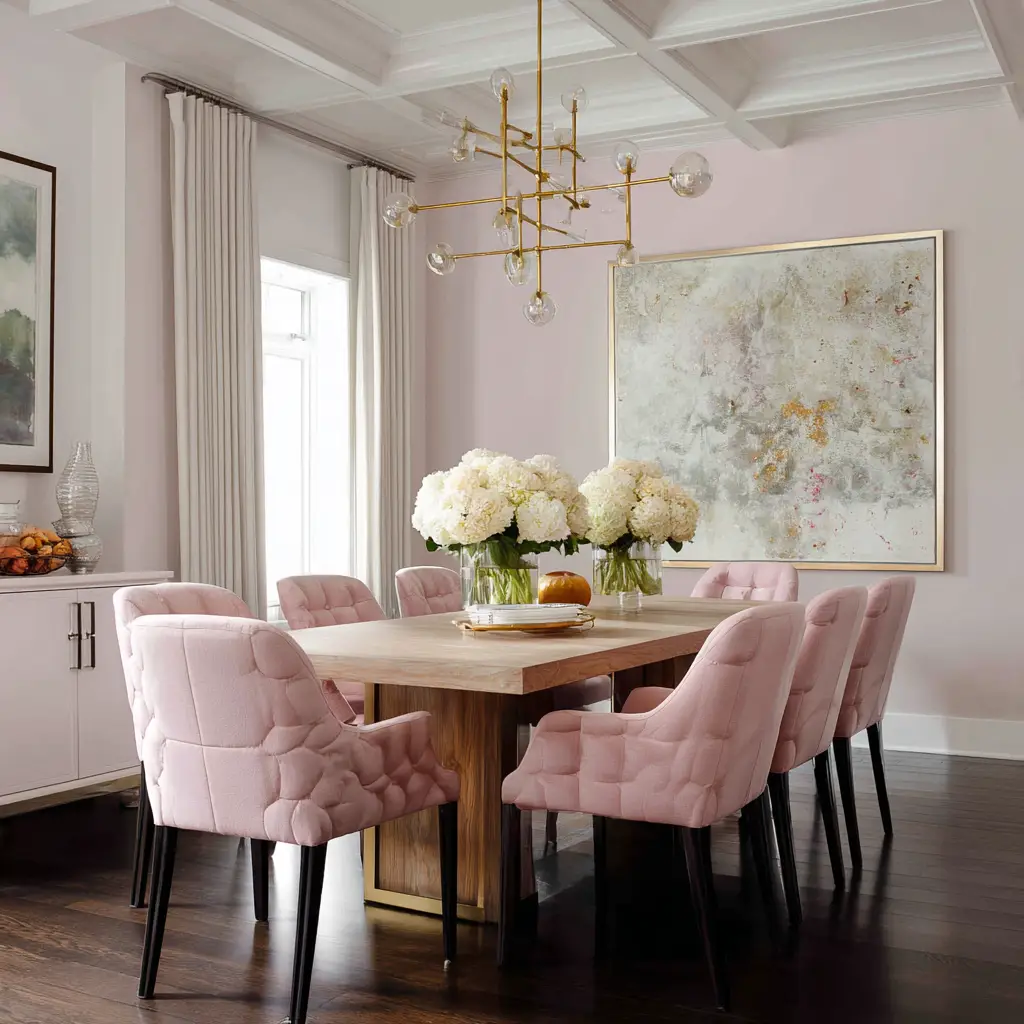
10. Soft Pink and White
A subtle, muted pink paired with crisp white feels delicate and uplifting. Perfect for more feminine, soft, or shabby chic interiors.
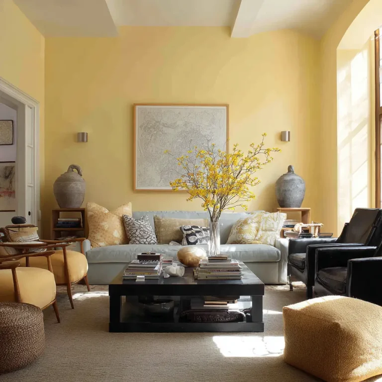
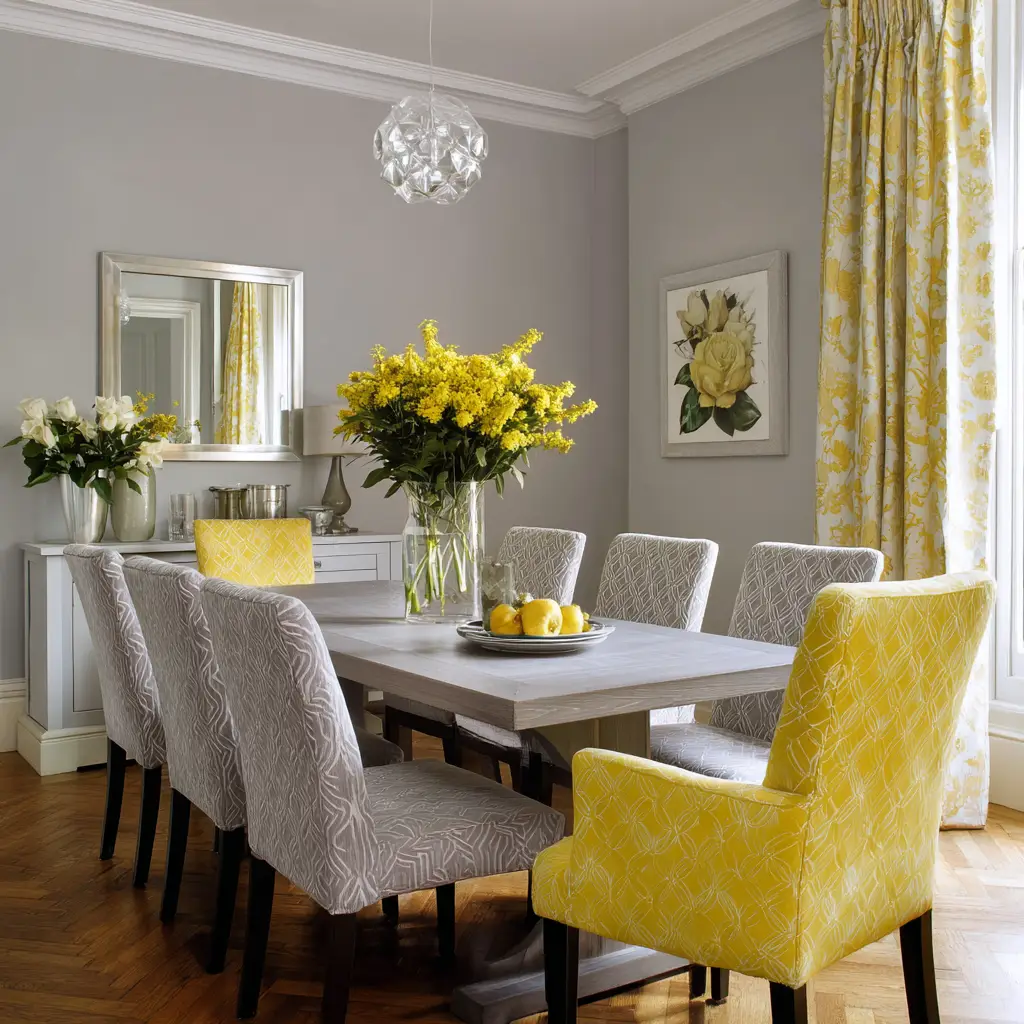
11. Grey and Yellow
A soft grey backdrop combined with cheerful yellow accessories (think table runners or artwork) brings brightness and freshness without overwhelming the space.
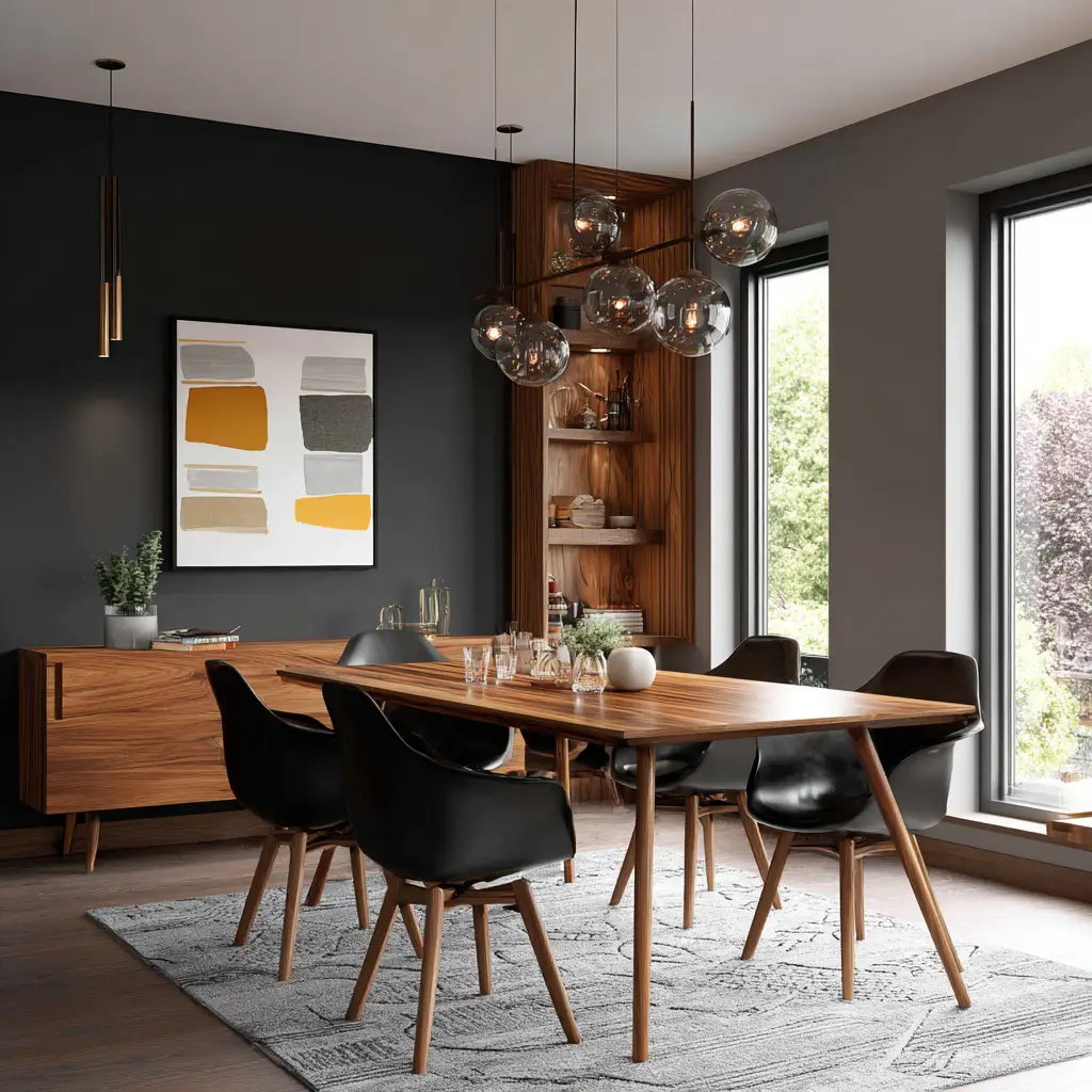
12. Black and Wood Tones
Black walls or furniture paired with warm wood flooring and natural accents create a cozy, modern vibe. Add warm lighting for extra intimacy.
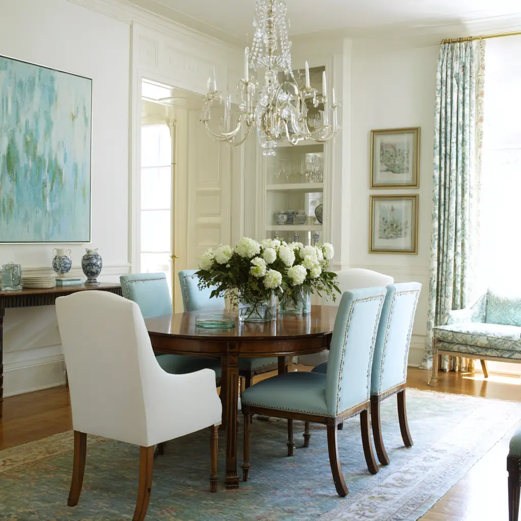
13. Pale Blue and White
This classic, clean combination is refreshing and light. It works especially well in coastal or Scandinavian-inspired dining rooms.
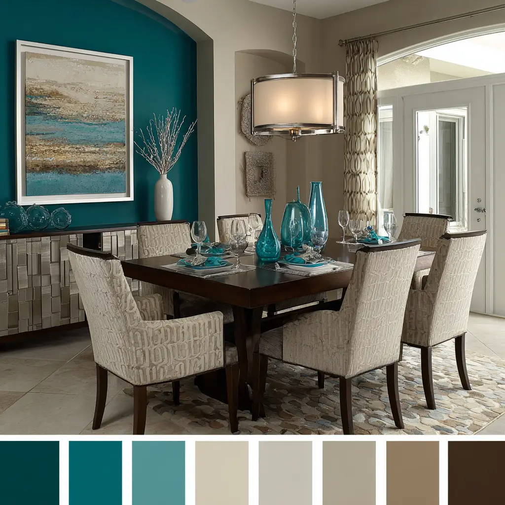
14. Teal and Tan
Deep teal gives richness, while tan or camel adds warmth. This contrast feels modern and grounded—great for mid-century modern decor.
15. Cream and Copper
A cream base feels soft and neutral, while copper adds a metallic warmth. Use copper in light fixtures or decorative accents to create a gentle glow.
16. Blush and Bronze
For a slightly glam but subtle look, blush pink walls or upholstery can be accented with bronze mirrors, candle holders, or chairs.
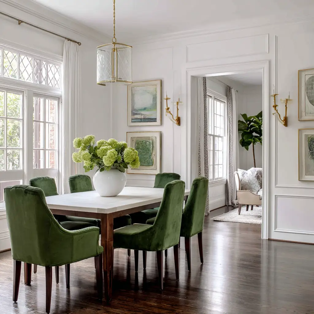
17. White and Greenery
All-white walls and furnishings come to life when paired with green elements—either painted details or through actual potted plants and botanical art.
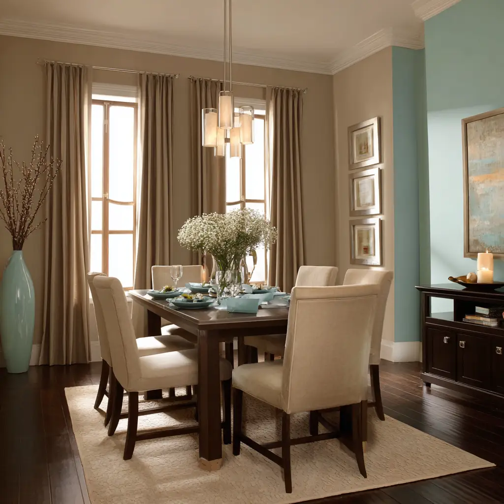
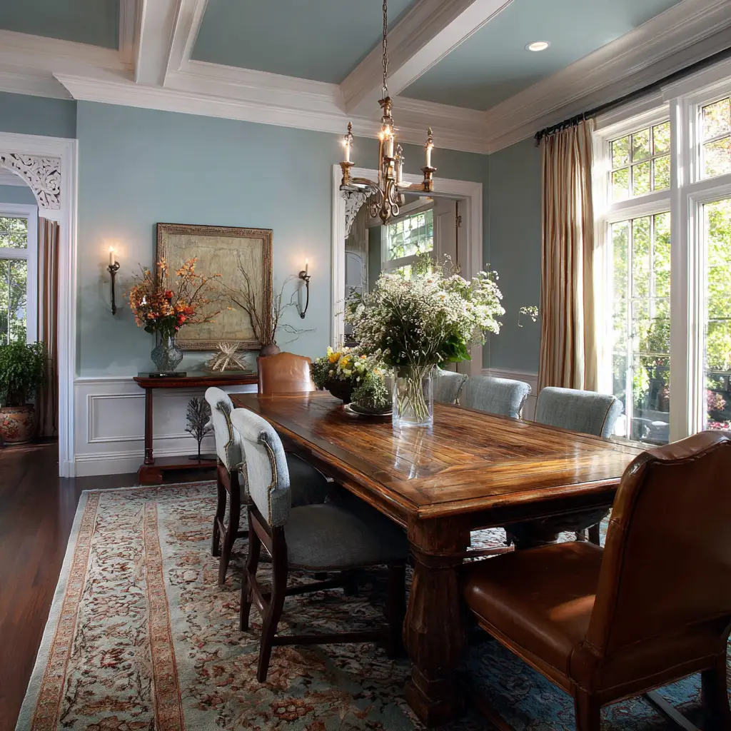
18. Warm Taupe and Sky Blue
A mix of grounded taupe with airy sky blue gives a dreamy, tranquil feel. This pairing is ideal for a space where calm conversations are shared.
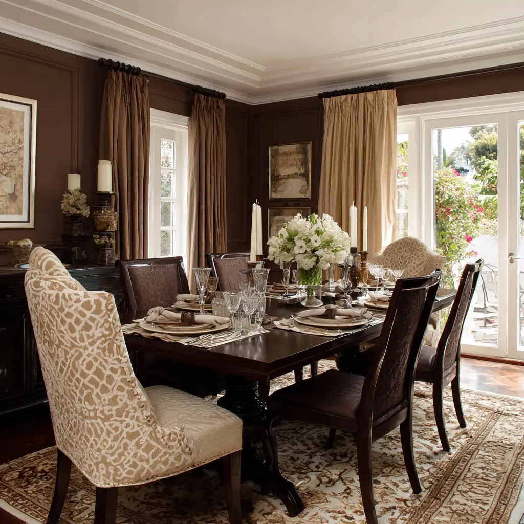
19. Chocolate Brown and Cream
For a more traditional palette, dark chocolate paired with soft cream creates contrast and warmth. Add brass or gold details for a polished touch.
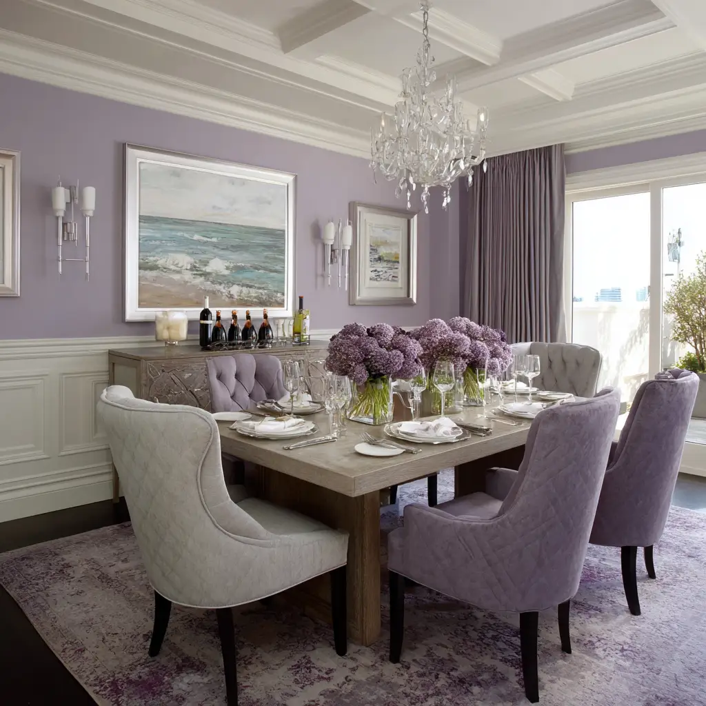
20. Lavender and Grey
Soft lavender and muted grey feel fresh and unexpected. It’s a subtle color scheme that works well in bright, airy spaces.
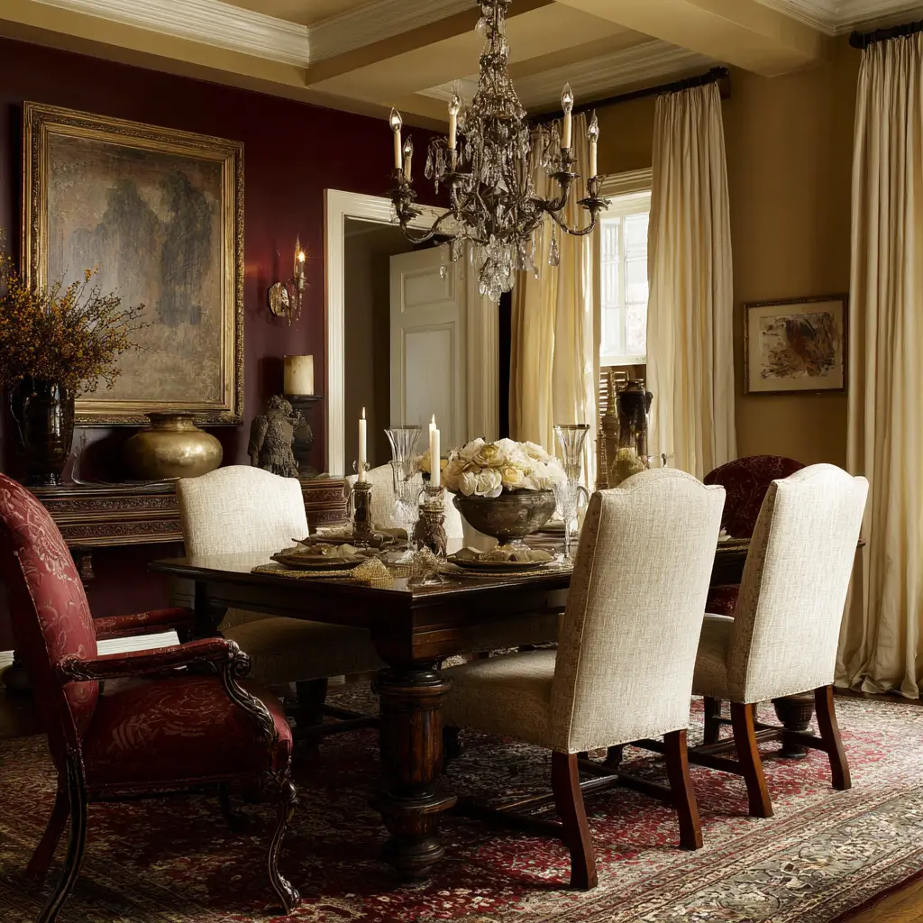
21. Maroon and Off-White
A deep maroon wall adds drama and pairs well with off-white trims or linens to balance its richness. This palette suits classic or formal dining spaces.
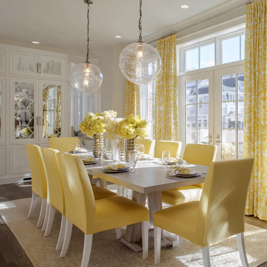
22. Yellow and White
A cheerful combination, yellow adds sunshine and energy to white-walled dining rooms. Keep it toned down with pale yellows or go bold with golden hues.
23. Dusty Blue and Walnut
Dusty blue creates a soothing mood, and when paired with rich walnut woods, the space feels both grounded and airy.
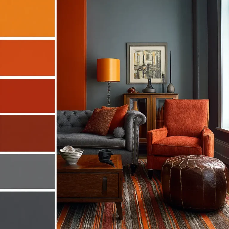
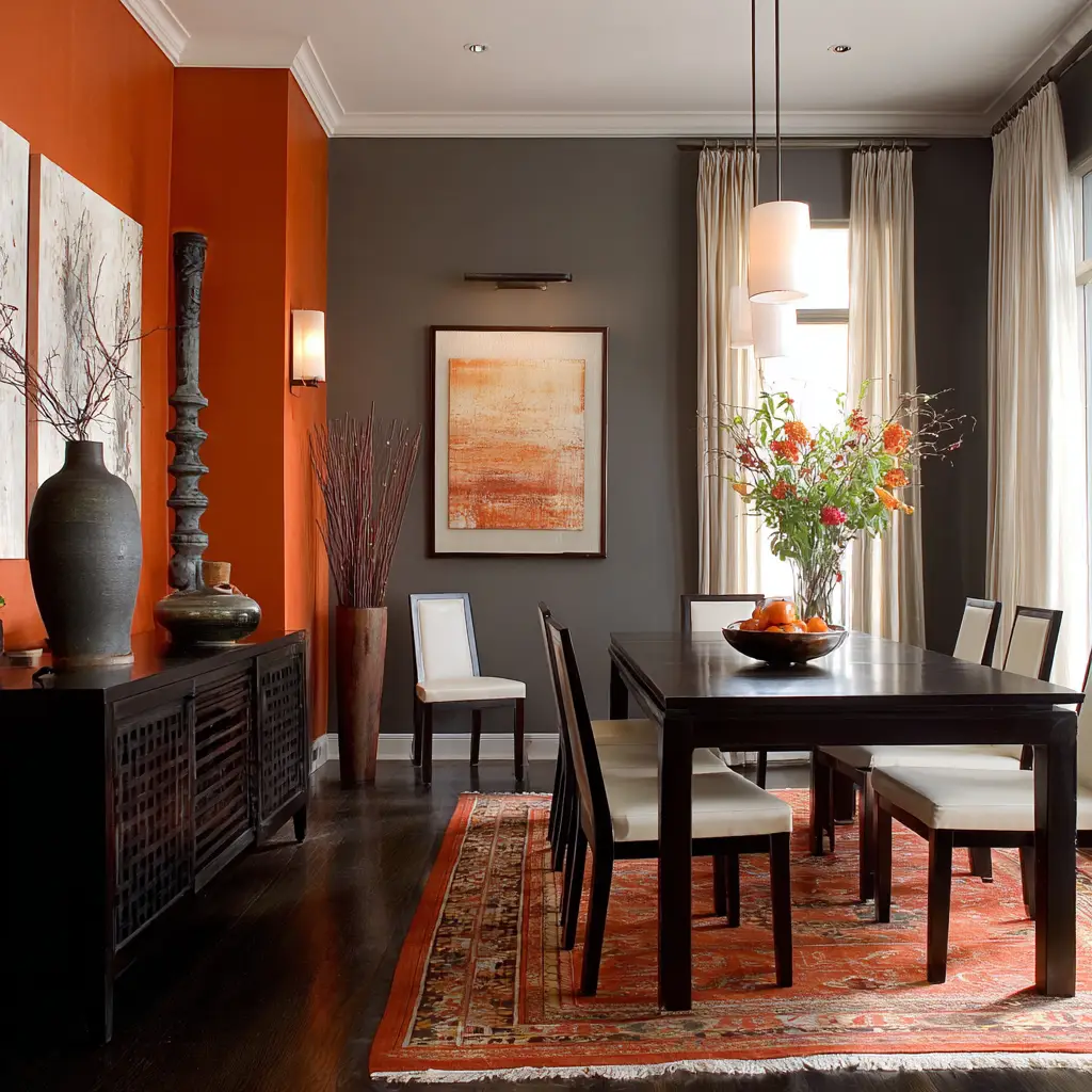
24. Burnt Orange and Grey
Burnt orange provides a vintage warmth, especially when balanced with light or dark greys. Perfect for retro or boho-inspired dining areas.
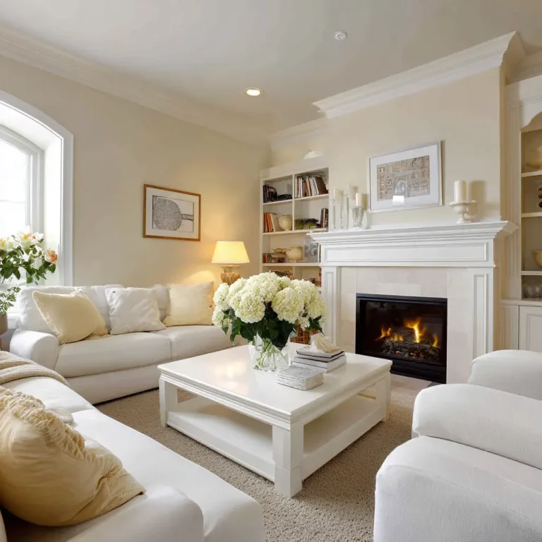
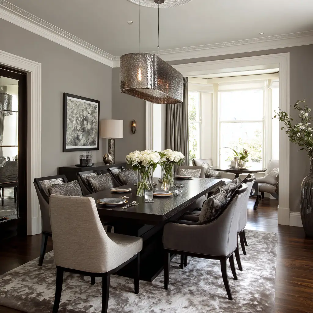
25. Neutral Monochrome
Shades of white, ivory, and soft beige layered throughout the room create a serene and sophisticated look. Add depth with natural textures like linen, jute, or wood.
FAQs
How do I choose the best color scheme for my dining room?
Consider your home’s existing style, the amount of natural light the room receives, and how you want the space to feel—warm, airy, elegant, or vibrant. Always test samples before committing.
Should dining room walls be darker or lighter?
Both can work. Lighter shades create openness, while darker tones feel cozier and more intimate. The choice depends on your desired atmosphere and room size.
Can I mix bold and neutral colors in the same space?
Yes, bold colors work well as accents—like a feature wall or dining chairs—while neutrals help balance the overall palette.
Are warm colors better for a dining room?
Warm tones like terracotta, mustard, and beige can make the space feel inviting and comfortable. However, cool tones can be equally beautiful when paired with the right textures and lighting.
How many colors should I include in a dining room color scheme?
Stick to 2–3 main colors and 1–2 accent shades. This keeps the palette cohesive without feeling chaotic.
Conclusion
Your dining room should feel like an extension of your personality and home style. The right color scheme not only enhances the look but also sets the tone for the experiences you share around the table. Whether you lean toward deep jewel tones, soft pastels, or timeless neutrals, these 25 dining room color scheme ideas offer inspiration to make your space truly inviting and beautiful. Choose the palette that speaks to you, and let your dining room become a place where moments are celebrated and memories are made.