21 Living Room Color Scheme Ideas
Choosing the right color scheme for your living room isn’t just about paint—it’s about creating a space that reflects your personality and the feeling you want to evoke when you walk in. Whether you’re aiming for cozy, bold, minimalist, or cheerful, the color palette sets the tone. From timeless neutrals to bold color combos, these 21 living room color scheme ideas will help you design a space that feels as inviting as it looks.
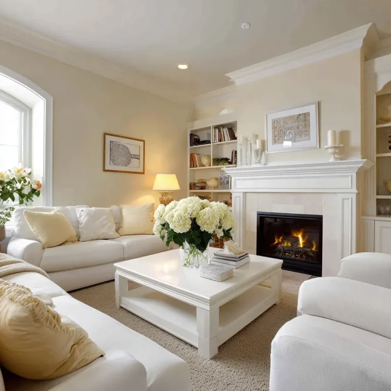
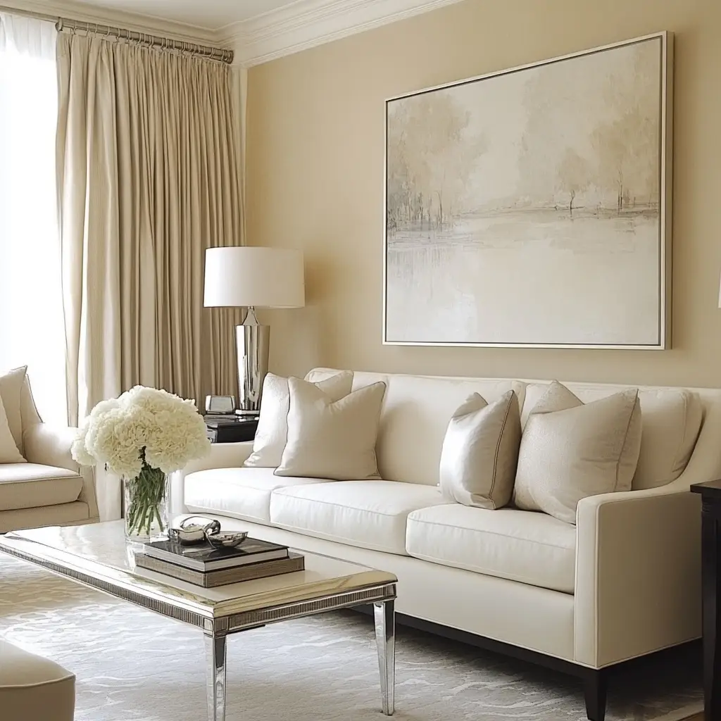
1. Classic White and Beige
If you want a calming, sophisticated vibe, try a blend of soft whites and warm beiges. This neutral combination opens up the space, makes it feel airy, and allows natural light to take center stage. Layering textures like linen, wood, and rattan keeps the look interesting and cozy.
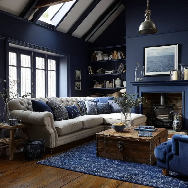
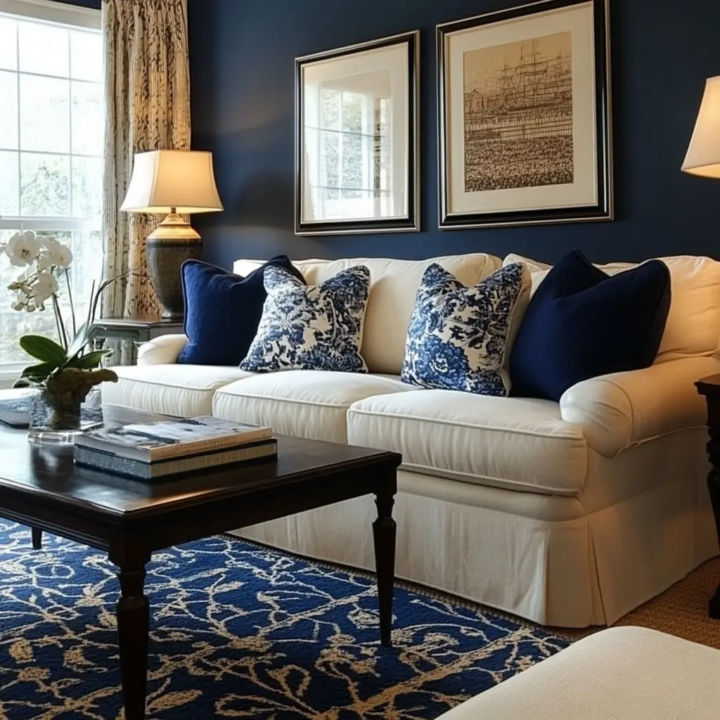
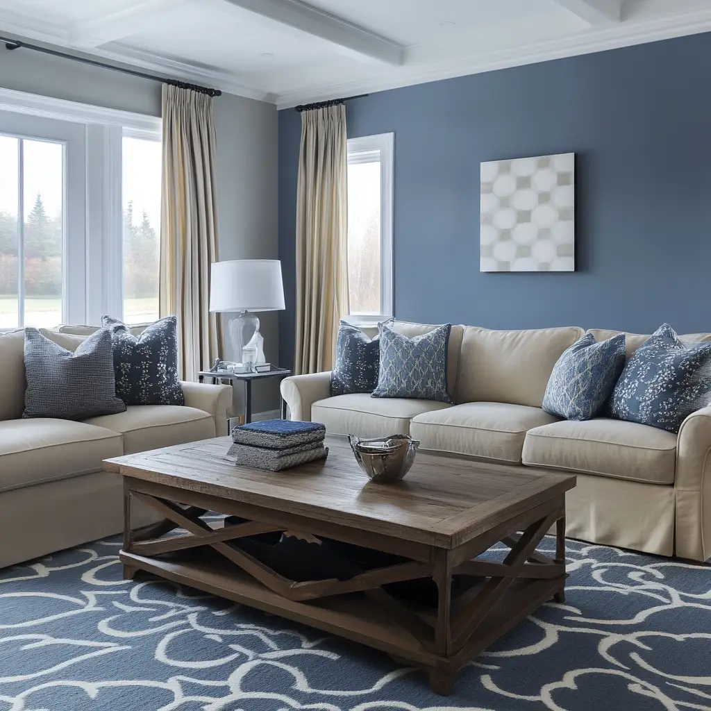
2. Navy Blue and Cream
Deep navy blue paired with cream creates a beautiful balance between bold and soft. Use navy on an accent wall or in your furniture, and cream on surrounding walls and textiles for a grounded yet elegant look.
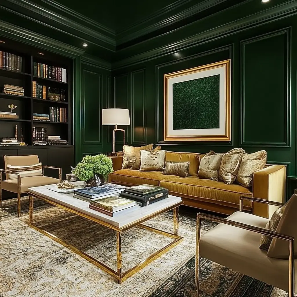
3. Forest Green and Gold
Forest green brings an earthy richness, while touches of gold add a sense of luxury. This palette is perfect for those who love a cozy yet dramatic ambiance. Pair with velvet cushions and wood tones for added depth.
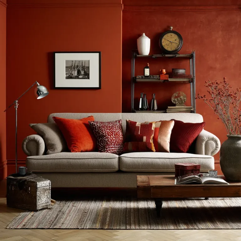
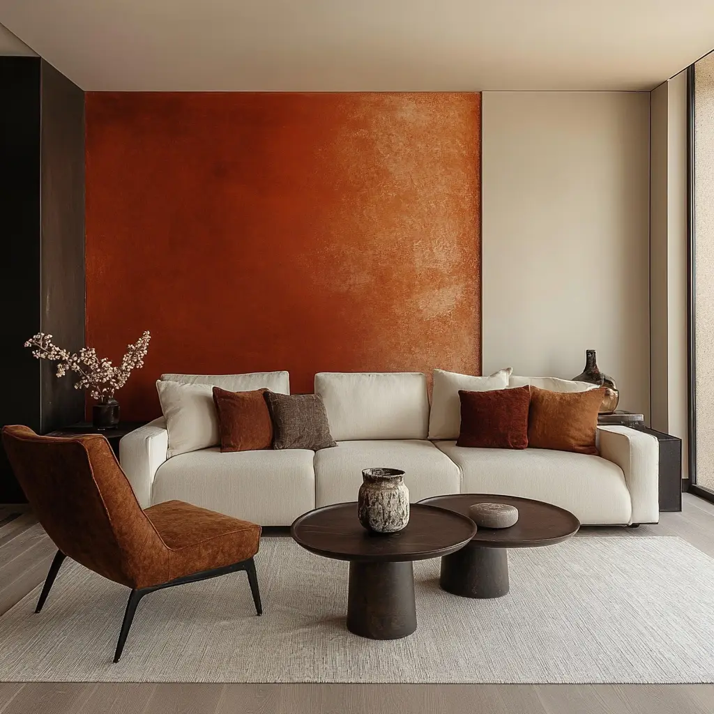
4. Warm Terracotta and Off-White
Terracotta has a naturally comforting feel, especially when matched with soft off-white or ivory. This color scheme warms up any space, making it feel lived-in and full of character.
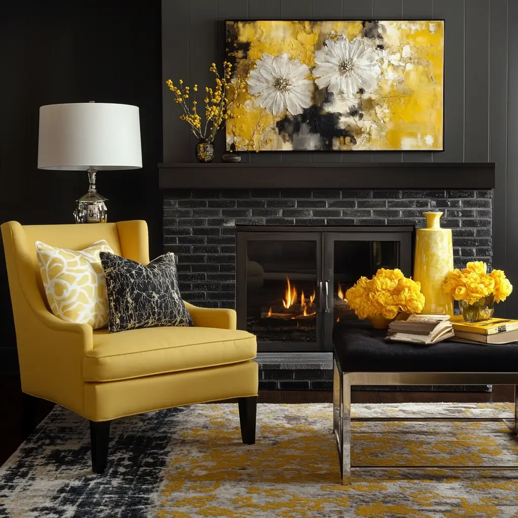
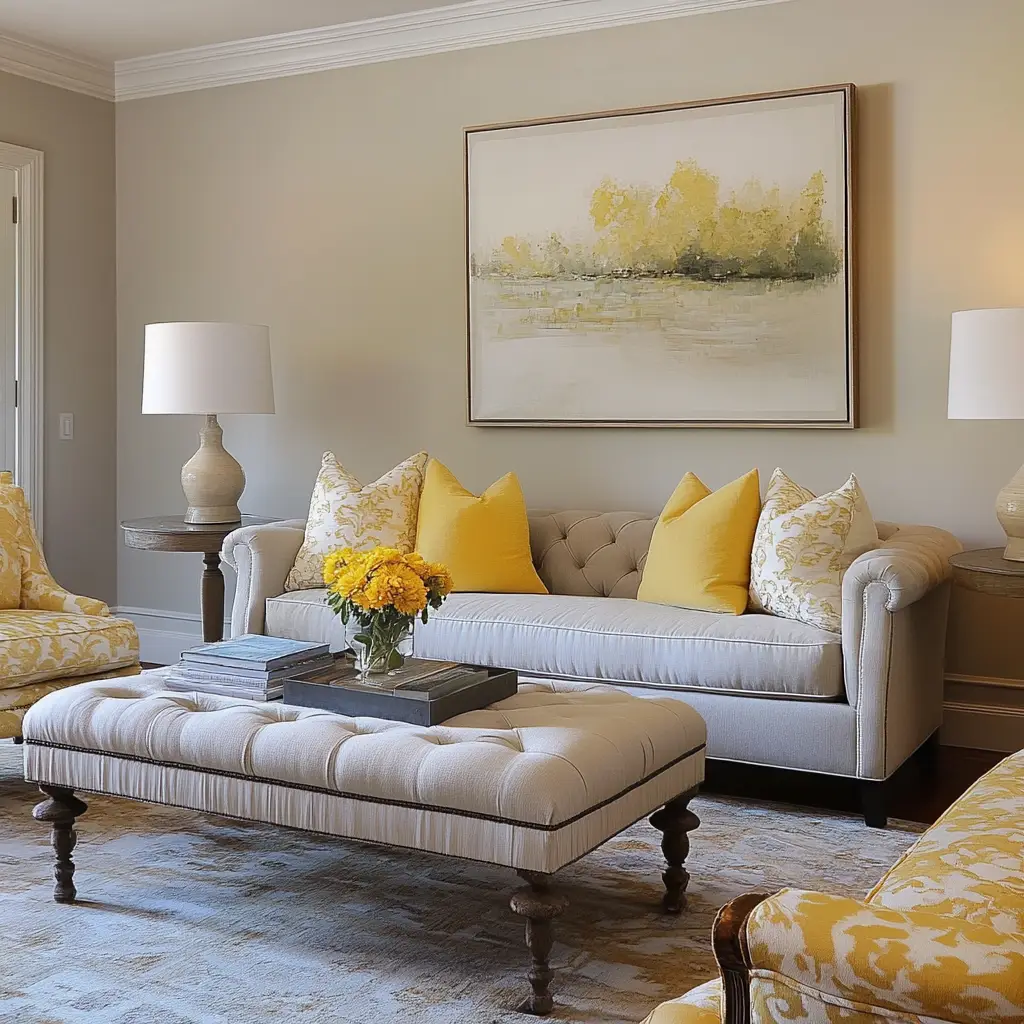
5. Charcoal Gray and Mustard Yellow
A deep charcoal base with pops of mustard yellow creates a bold, contemporary contrast. It works well in modern spaces that crave energy without overwhelming the senses.
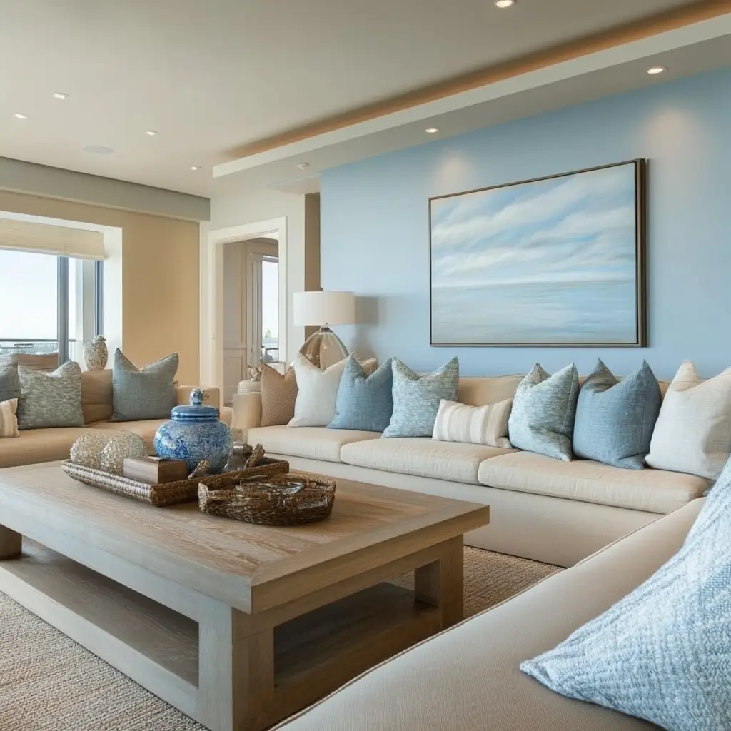
6. Sky Blue and Sandy Beige
This coastal-inspired color combo is breezy and relaxed. Sky blue evokes open skies, while sandy beige grounds the room. Add natural elements like driftwood and cotton fabrics for a beachy vibe.
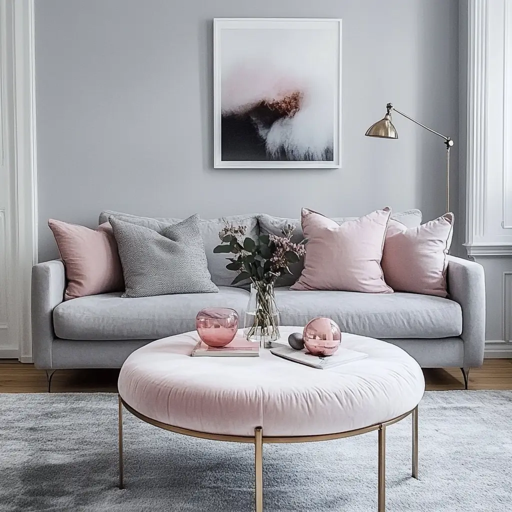
7. Blush Pink and Dove Gray
Blush and gray are a dreamy, delicate pair. The blush adds warmth, while gray keeps things neutral and calm. It’s perfect for romantic, soft-style living rooms.
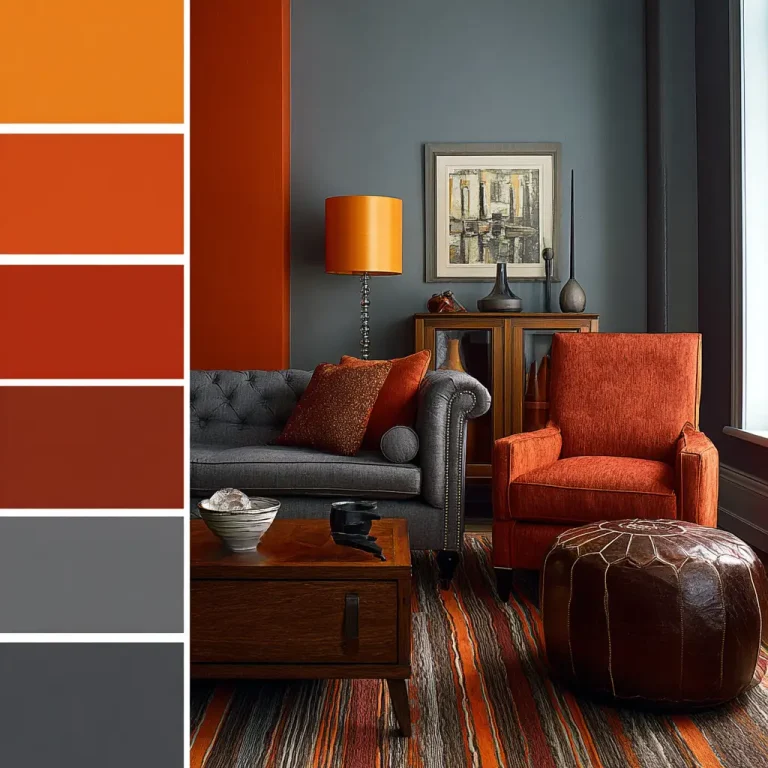
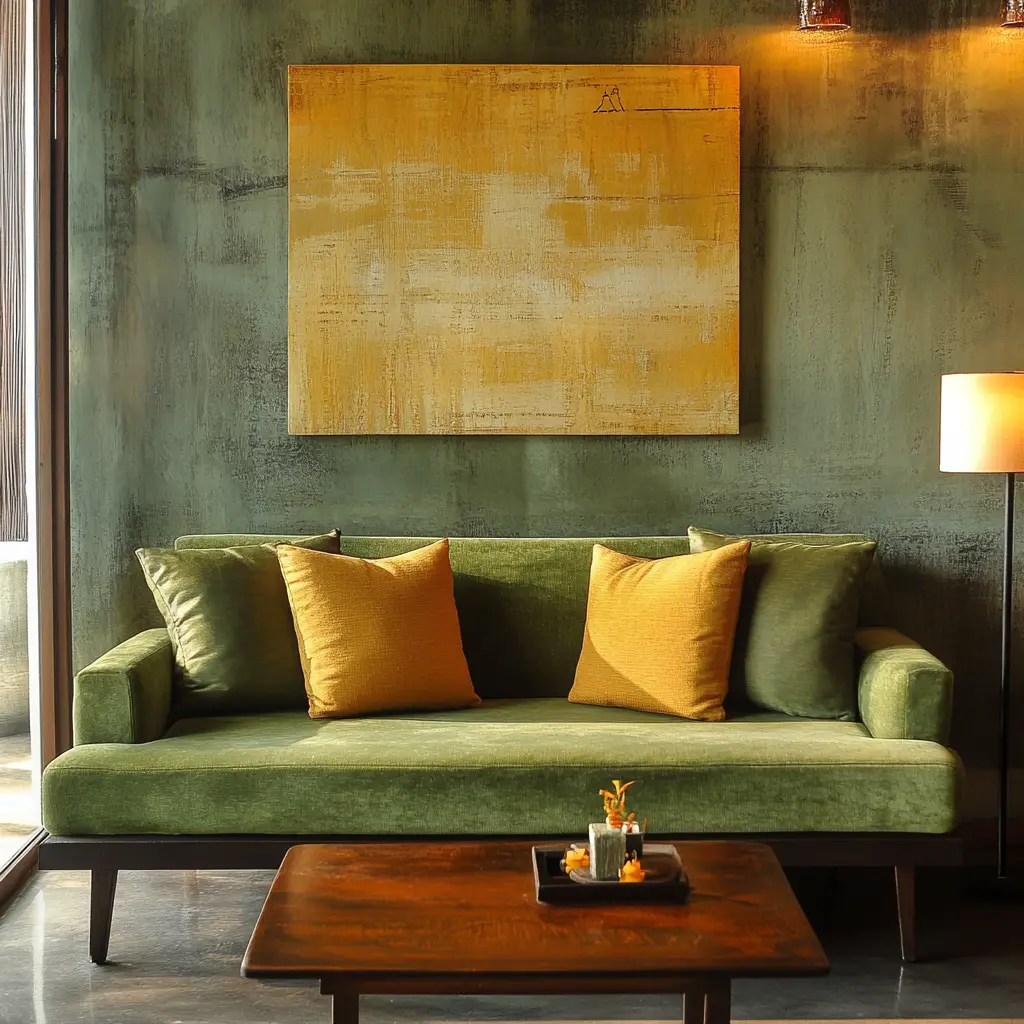
8. Olive Green and Rust
Olive green and rust create a cozy, earthy color palette that feels both grounded and stylish. Use this combination in homes with lots of natural textures and bohemian decor.
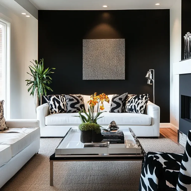
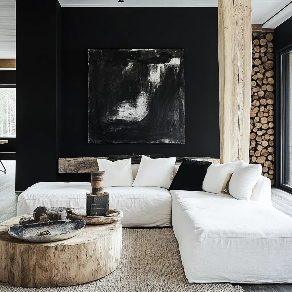
9. Black, White, and Wood
A black and white foundation instantly gives your space a modern edge, and when you add in wood tones—whether flooring, beams, or furniture—you bring in the warmth it needs to feel like home.
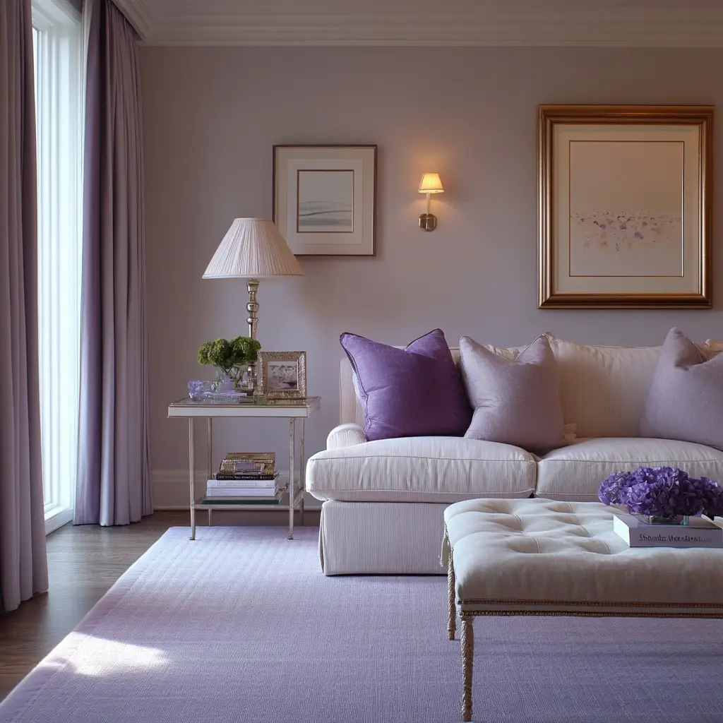
10. Soft Lavender and Cream
Lavender adds a soft, almost ethereal quality to a space, especially when grounded with cream or off-white. This color scheme feels peaceful and is great for smaller or more intimate rooms.
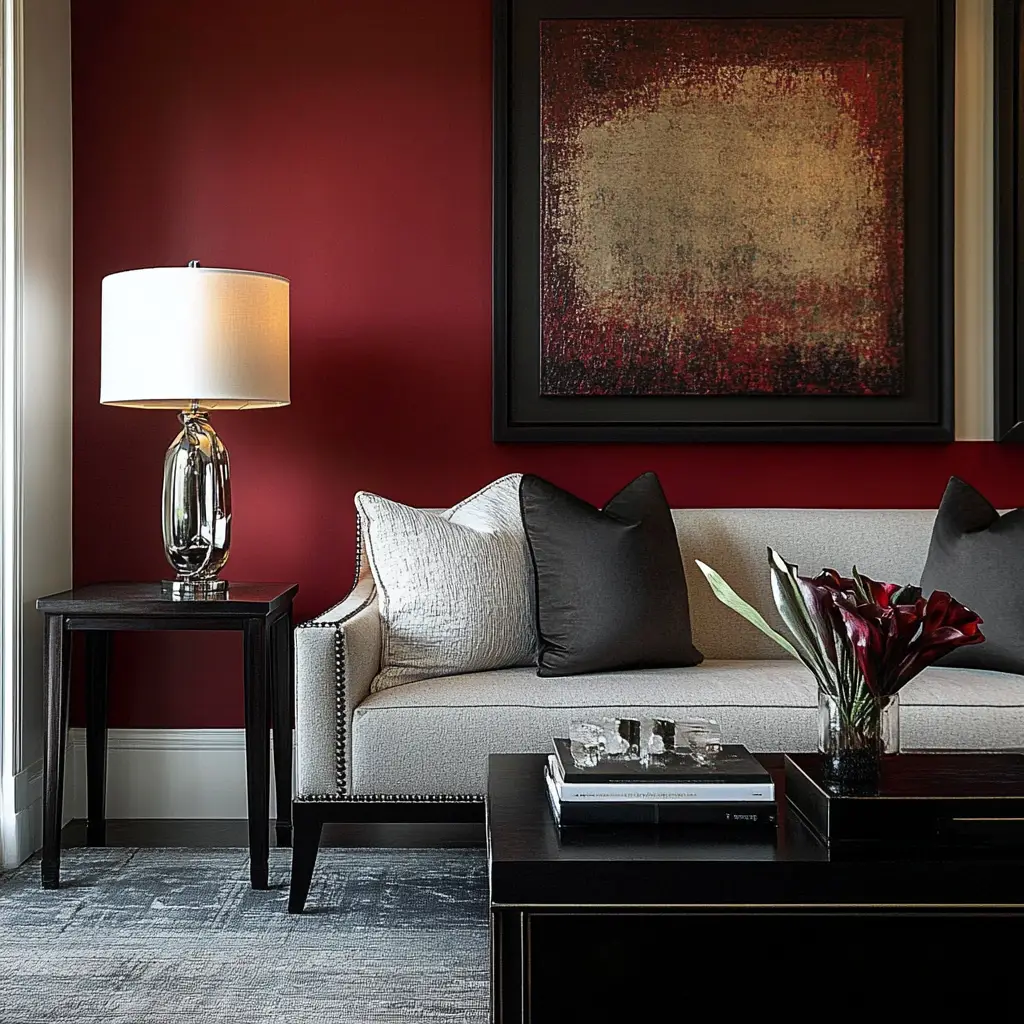
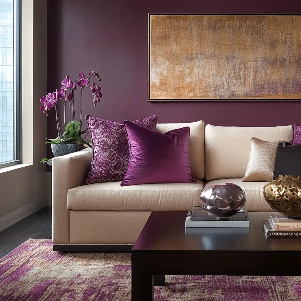
11. Rich Burgundy and Gray
Burgundy offers depth and drama, while gray tones it down for everyday livability. It’s a perfect pairing for elegant, traditional, or classic-style interiors.
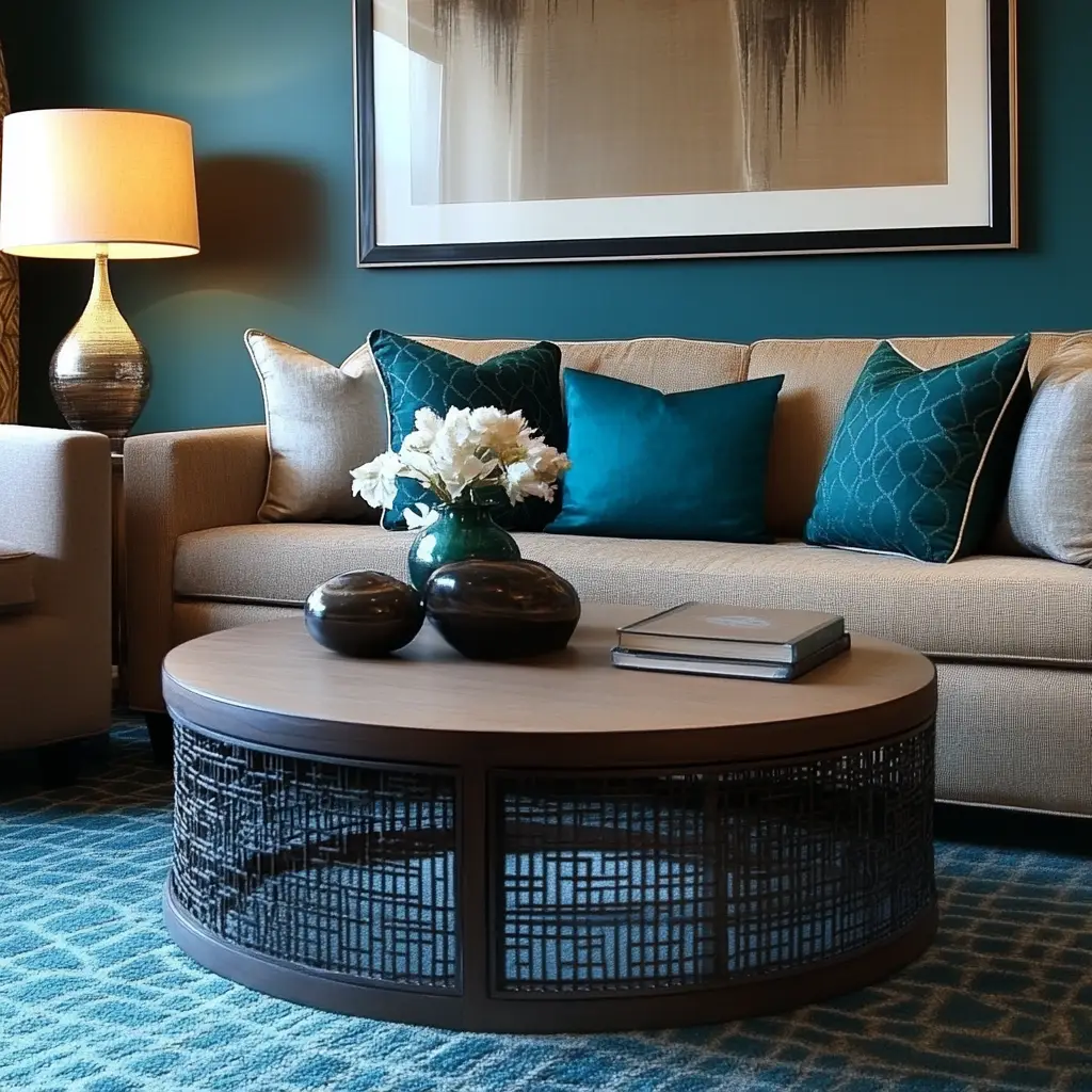
12. Teal and Tan
Teal brings vibrancy and sophistication, while tan tones soften the look. Use this combo with modern artwork and clean-lined furniture to balance energy and calm.
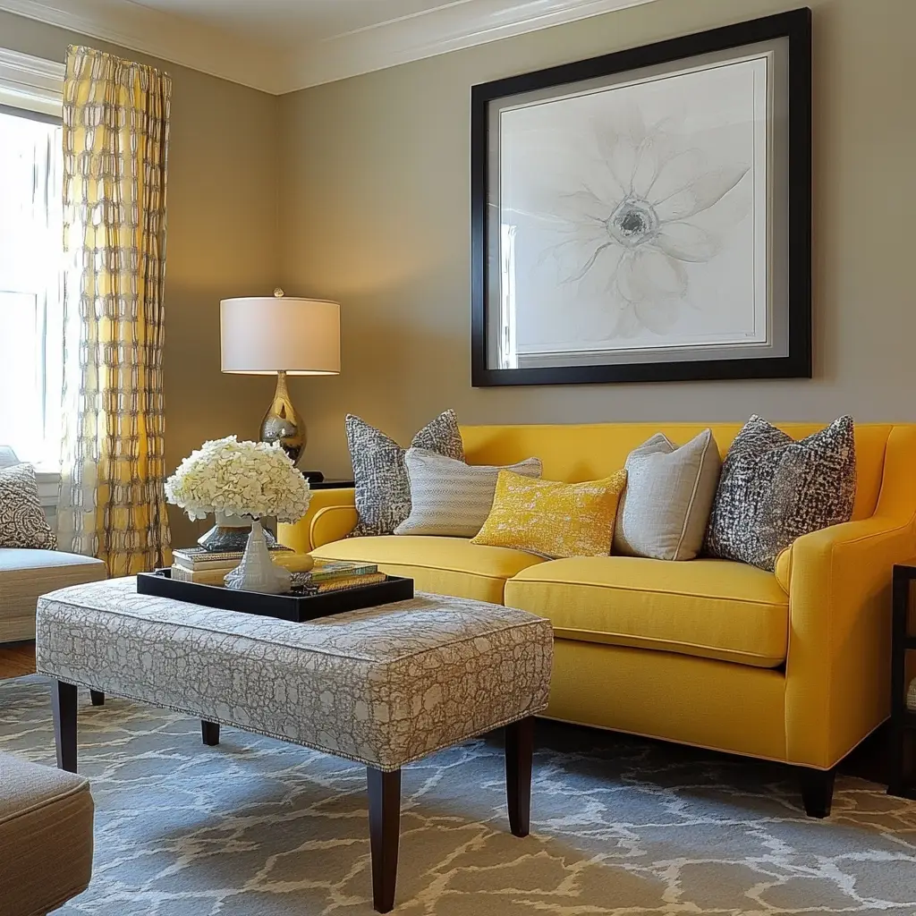
13. Warm Yellow and Soft Gray
A soft gray base layered with warm yellow accents creates a cheerful but balanced room. The yellow brings in sunlight, and the gray keeps it grounded and relaxing.
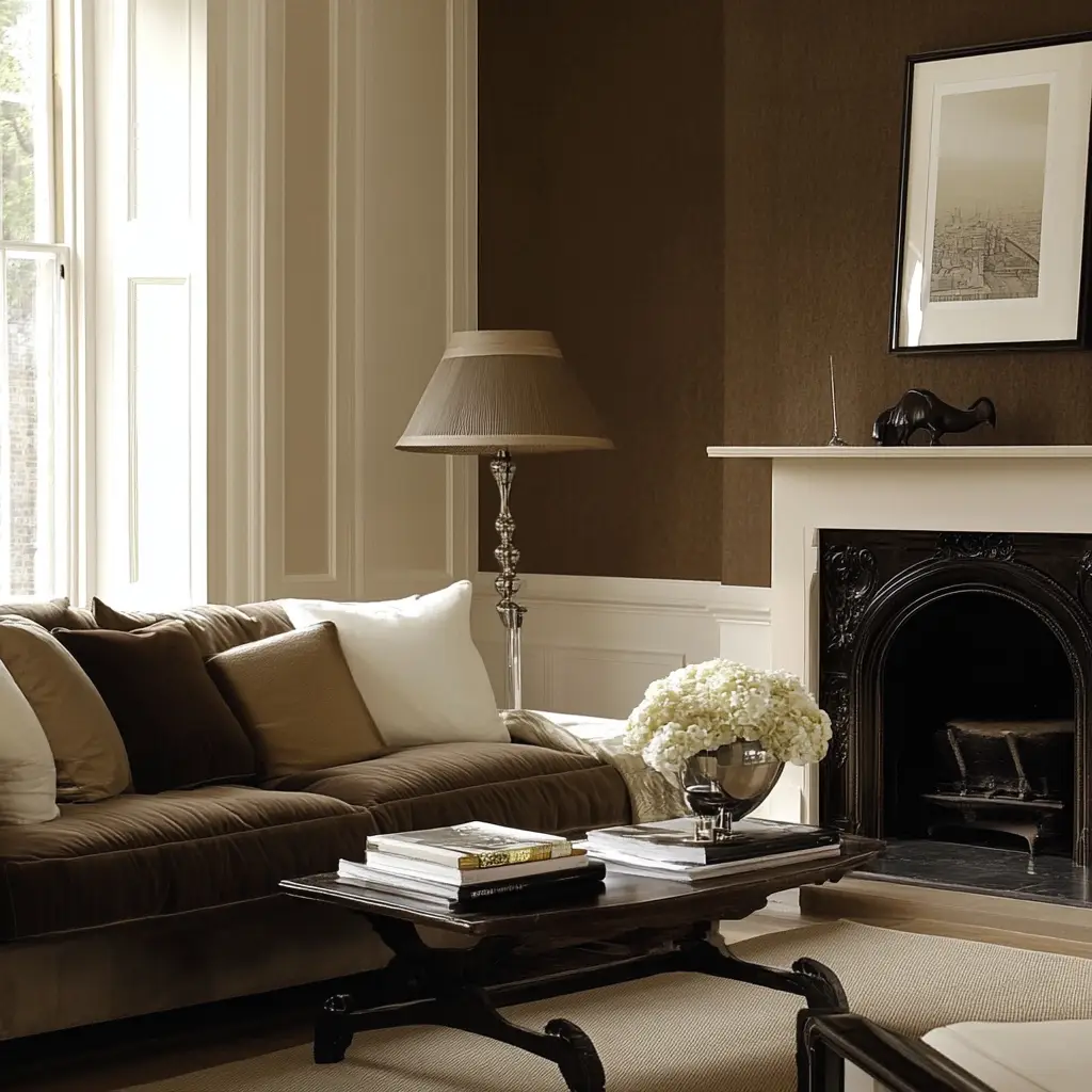
14. Chocolate Brown and Cream
Chocolate brown offers rich coziness, especially in colder climates. Pair it with cream or soft beige to prevent it from feeling too heavy, and use plush fabrics for extra comfort.
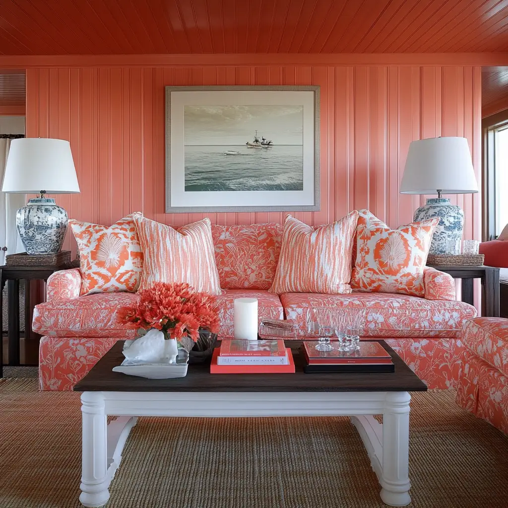
15. Coral and White
Coral adds a fresh, uplifting burst of color and works wonderfully with crisp white. This combination feels playful and is ideal for bright, sunny living rooms.
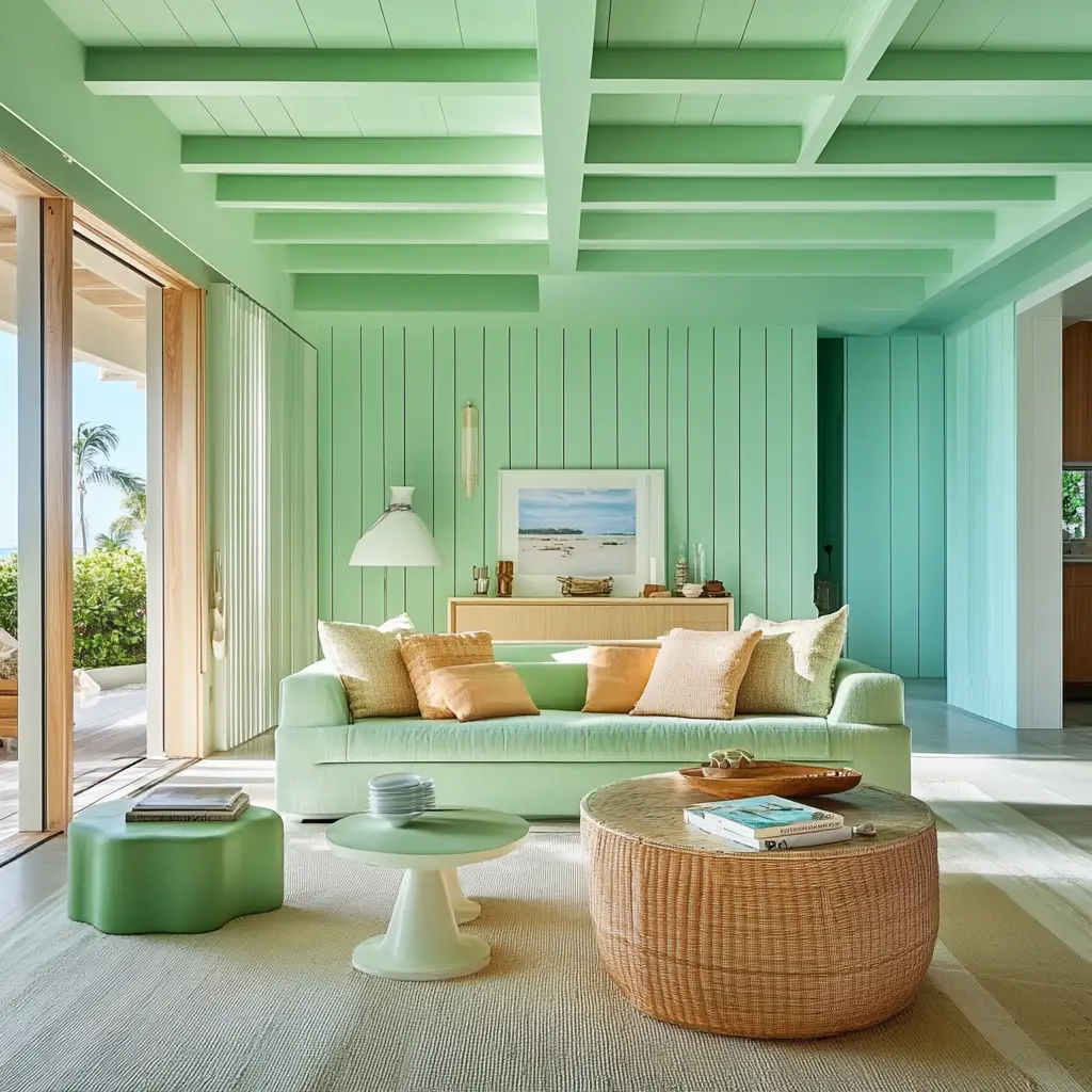
16. Mint Green and Light Wood
Mint green is refreshing and youthful. When paired with light wood tones, it feels clean and Scandinavian. Add minimalist furniture and lots of plants for a rejuvenating space.
17. Dusty Blue and Taupe
This muted color palette feels classic and calming. Dusty blue provides subtle color, while taupe keeps things neutral. It’s great for a serene, understated style.
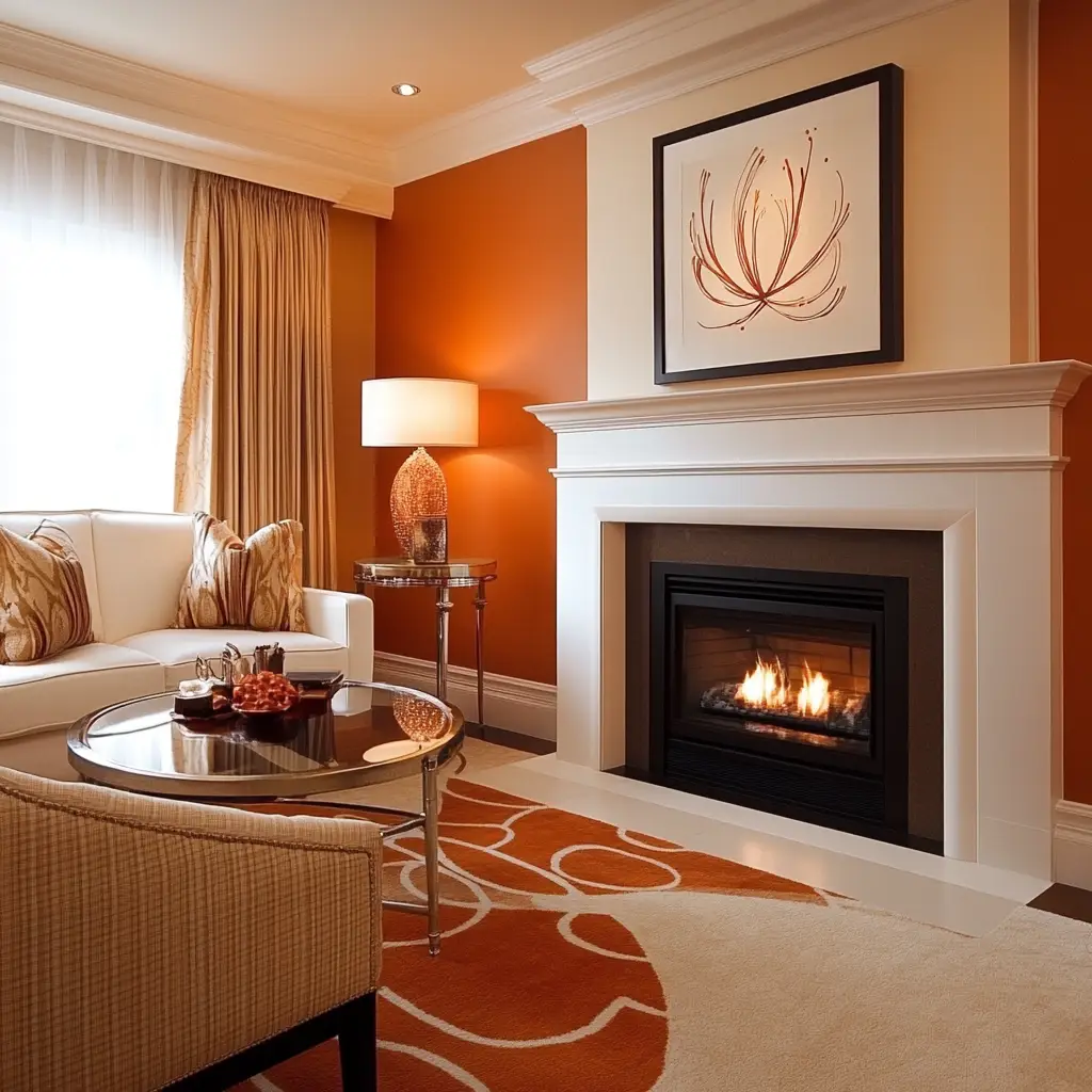
18. Burnt Orange and Cream
Burnt orange gives your space character and charm. Cream softens its intensity, creating a space that’s warm and inviting. Use in fall-themed or Southwestern-inspired decor.
19. Pale Yellow and Light Gray
Pale yellow walls with soft gray accents feel gentle and sunny without being overwhelming. This is a cheerful option that works well in family-focused or farmhouse-style homes.
20. Plum and Beige
Deep plum adds richness and romantic appeal, while beige keeps the room from feeling too dark. Try plum in cushions or curtains, with beige sofas or rugs to balance it out.
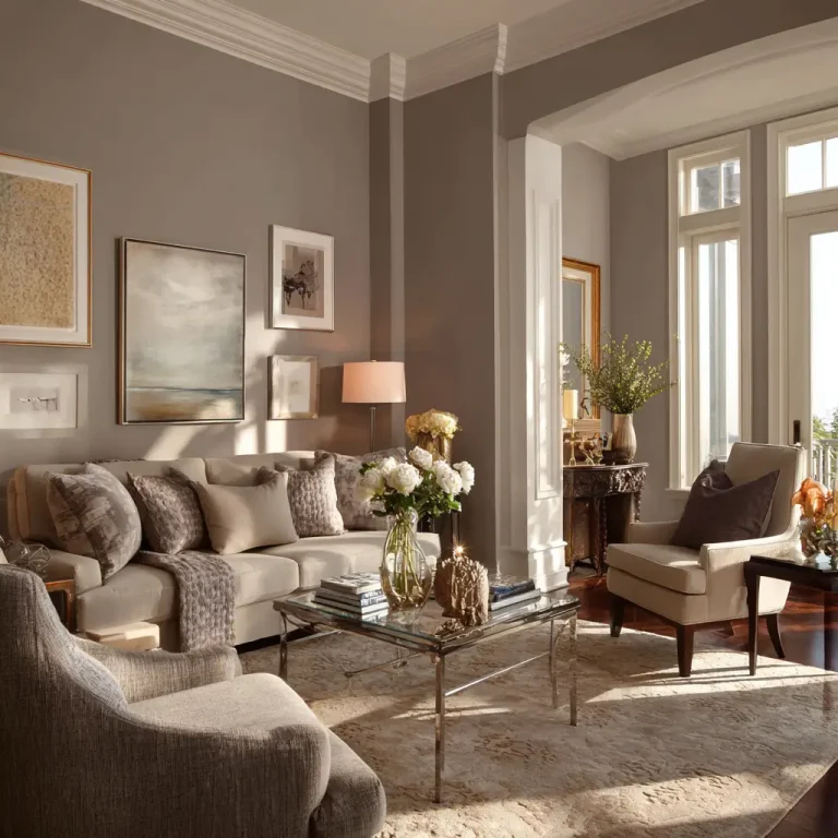
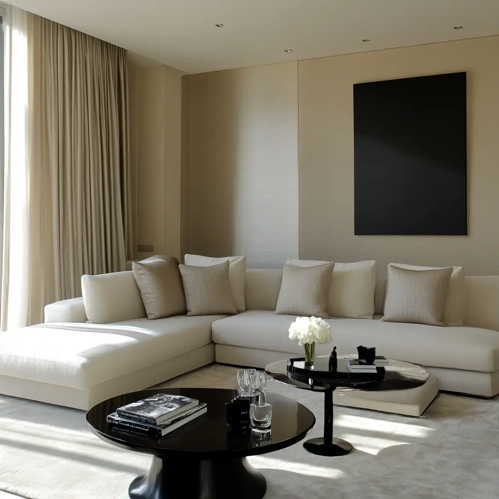
21. Monochrome Neutrals
Layering whites, grays, and soft browns in varying shades creates a sophisticated, cohesive look. This palette is calming, elegant, and easy to personalize with texture and décor.
FAQs on Living Room Color Schemes
How do I choose the right color scheme for my living room?
Start by considering how you want the room to feel—calm, energetic, cozy, or elegant. Then, look at your natural light, furniture, and existing finishes to choose colors that complement rather than clash.
Can I use bold colors in a small living room?
Yes, but use them thoughtfully. A bold accent wall or brightly colored furniture can add character without making the space feel cramped. Pair with light neutrals to maintain balance.
What’s the safest color scheme for resale value?
Neutral tones like white, beige, gray, and soft pastels tend to have the broadest appeal. You can always add color through removable accents like pillows, rugs, or wall art.
How many colors should I use in my living room?
A good rule is the 60-30-10 ratio: 60% main color, 30% secondary color, and 10% accent. This creates visual harmony and makes the space feel intentional and well-designed.
What colors make a room look bigger?
Light colors like white, pale gray, light beige, and soft pastels reflect light and make a space feel more open and airy. Pair with mirrors and natural lighting for best results.
Conclusion
Your living room color scheme isn’t just a design decision—it’s a feeling you create every time you walk into the space. Whether you lean toward soft, neutral tones or crave bold color contrasts, the palette you choose should reflect your lifestyle, your taste, and the kind of atmosphere you want to come home to.
These 21 color scheme ideas offer a mix of timeless, trendy, and cozy options that can fit any style—from modern and minimal to vibrant and expressive. Trust your instincts, play with swatches, and let your living room become a canvas for color, comfort, and character.